
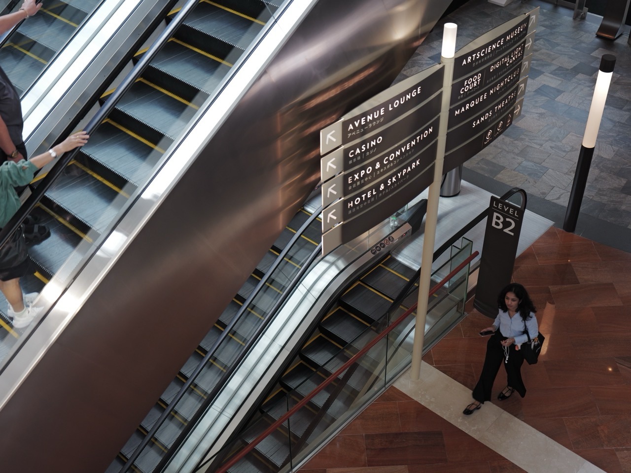
You arrive at a convention centre you have never visited.
Your ticket says Hall C.
The building has four levels, three entrances, two temporary exhibition halls, a sponsor lounge, a quiet room, several toilets and a registration desk that has moved since yesterday.
You have eight minutes.
Nobody hands you a lecture on spatial cognition.
You look for a sign.
That sign is doing more work than it appears to.
It is teaching you a temporary place fast enough for you to act inside it.
That is event wayfinding.
Quick Read
Event wayfinding is the temporary information system that helps unfamiliar people understand where they are, where they need to go and which route is available now.
It can use:
- location plans and maps;
- direction signs;
- destination names;
- zone colours or numbers;
- landmarks;
- “You Are Here” markers;
- confirmation signs after turns;
- floor and room identifiers;
- staff assistance;
- printed guides;
- mobile apps and digital maps;
- temporary change notices.
A particularly useful current anchor is ISO 28564-1:2026, published in July 2026. The standard sets requirements and principles for public-information maps, location plans and diagrams intended to help people understand an environment, locate facilities and determine routes. Its scope includes public facilities such as sporting and entertainment complexes. The wider ISO 28564 family separately covers location and direction signs, indexing signs, installation and assessment.
This gives us an important boundary immediately:
wayfinding is not one arrow on one wall.
It is a coordinated information system.
Checked against current live eduKateSG ownership and current authoritative standards: 4 September 2026.
The Direct Answer
Event wayfinding works by placing the right spatial information at the points where participants need to make decisions, so a person can repeatedly answer three questions—where am I, where is my destination, and what should I do next—without having to understand the whole venue at once.
The best system does not force visitors to become expert navigators.
It reduces the amount they need to know.
Temporary Places Create an Unusual Navigation Problem
A city street may remain in place for decades.
An event can redesign a building overnight.
Yesterday:
Hall 2 = empty.
Today:
Hall 2 = registration + sponsor booths + workshop rooms B1–B8.
Tomorrow:
Hall 2 = gone from the event map entirely.
The event has created a temporary semantic layer over permanent architecture.
How Events Work | The Temporary World owns the broader creation of this temporary place.
Wayfinding owns the participant’s navigation through it.
The Visitor Does Not Need the Whole Map
Imagine entering a 40,000-square-metre event site.
A complete map contains enormous detail.
The participant usually needs one decision:
left or right?
Then another:
stairs, lift or corridor?
Good wayfinding decomposes a large spatial problem into a sequence of small decisions.
This is one reason decision-point signage matters so much.
The Decision Point Is the Real Unit of Design
A sign fifty metres before a junction can be forgotten.
A sign ten metres after a junction is too late.
The useful location is where the visitor still has enough time to choose.
Decision points include:
- entrances;
- corridor junctions;
- lift lobbies;
- stair choices;
- hall splits;
- outdoor path forks;
- registration queues;
- transitions between venue zones.
The strongest question for each point is:
What uncertainty will a first-time visitor have here?
Wayfinding Is a Chain, Not a Sign
Parking → Entrance B.
Entrance B → Registration.
Registration → Hall C.
Hall C → Workshop 4.
Workshop 4 → Accessible toilet.
Workshop 4 → Exit.
If one link is missing, the whole route can fail.
A perfect sign at the entrance cannot compensate for a silent junction later.
Wayfinding quality is therefore path-dependent.
Confirmation Signs Tell People They Did Not Make a Mistake
You turn left.
Walk fifty metres.
No sign.
Did you miss the destination?
Was the arrow wrong?
Should you turn back?
A small confirmation sign can remove all three doubts:
Hall C → 80 m.
Good systems do not only tell people when to turn.
They reassure them between turns.
“You Are Here” Converts the Map Into a Usable Relation
A map without current position can be intellectually correct and practically useless.
The visitor has to solve two problems:
- understand the map;
- locate themselves inside it.
A clear current-location marker collapses the second problem.
Now the visitor can reason relationally:
I am here.
Hall C is there.
This corridor connects them.
Map Orientation Can Help—or Quietly Betray the User
A wall map is mounted facing south.
North is drawn at the top.
The corridor in front of the user appears downward on the map.
Some users can mentally rotate that model easily.
Others cannot.
ISO 28564-1:2026 explicitly includes positioning and orientation among the design considerations for location plans.
The deeper event principle is:
a map should reduce mental transformation at the exact moment a person is trying to move.
Names Are Spatial Infrastructure
“Innovation Stage.”
“Stage 2.”
“Hall B.”
“Theatre East.”
These are not marketing decorations once people depend on them to navigate.
A destination name should remain stable across:
- ticket;
- website;
- mobile app;
- map;
- direction sign;
- door label;
- staff language.
If the app says “Forum Stage” but the venue signs say “Hall 4 Platform,” visitors have to infer that two labels refer to one place.
That is avoidable cognitive work.
Renaming Mid-Event Is More Expensive Than Changing a Sign
A sponsor changes.
The “Blue Stage” becomes the “Nova Stage.”
Now every representation may need reconciliation.
- printed map;
- digital map;
- website;
- programme;
- staff brief;
- signage;
- speaker instructions.
The cost of a naming change is not the cost of printing one new board.
It is the cost of restoring semantic consistency across the whole navigation system.
Numbers Work Differently From Names
Hall 1.
Hall 2.
Hall 3.
Numbers reveal order.
Names can reveal identity or purpose.
Neither is always superior.
A large event may combine them:
Zone B
Hall B3
“Future Cities” Stage.
Hierarchy makes a large temporary place addressable.
Colour Can Reduce Search—But Colour Should Not Carry the Whole Meaning
Blue zone.
Red zone.
Green zone.
Colour can make scanning fast.
But colour-only coding can fail for users with colour-vision differences, poor lighting, low-quality printing or screens that reproduce colour badly.
A stronger system uses redundant cues:
Blue + B + “Conference Halls.”
Multiple channels make the system more robust.
Landmarks Give Humans Something to Remember
“Turn left at the giant red sculpture.”
Sometimes that is easier than:
proceed 42 metres to Corridor Junction 3B.
Landmarks support mental maps by giving spatial memory distinctive anchors.
But event landmarks can move.
If the red sculpture is a temporary installation and gets relocated, the verbal wayfinding system breaks.
Use landmarks that are stable for the period in which people will rely on them.
The Map and the Sign Must Agree
The map sends you right.
The sign sends you left.
Which one wins?
From the visitor’s perspective, the system has failed.
A wayfinding family should behave like one coherent source of truth even if different vendors or teams produced its components.
This is one reason the ISO 28564 series treats maps, signs, indexes and installation as related parts of a wider public-information system.
Digital Wayfinding Can Update Faster Than Print
Workshop moved.
Outdoor route closed.
Queue relocated.
A digital map can update quickly.
A printed board cannot.
But digital systems create new dependencies:
- battery;
- network;
- screen readability;
- device compatibility;
- user willingness to install or open an app.
Good events use digital flexibility without assuming every visitor has a perfect phone, data connection and accessible interface.
Printed Maps Have One Beautiful Property: They Do Not Run Out of Battery
A paper map cannot live-update.
It also does not need a login.
That trade-off matters.
Resilient wayfinding often combines channels rather than betting everything on one.
Staff Are Part of the Wayfinding System
“Where is Hall C?”
The volunteer says:
Go upstairs, turn left, follow the blue signs.
Now the event has a human navigation interface.
How Events Work | The Volunteer owns the temporary human-capacity mechanism.
Wayfinding owns the information that volunteer must transmit accurately.
If signs update but staff are not re-briefed, the physical and human navigation systems diverge.
A Route Change Is an Information Incident
A corridor closes.
The new route is perfectly safe.
But the old signs still point into the closed corridor.
The physical problem has been solved.
The information problem has not.
Route changes need coordinated updates across:
- direction signs;
- maps;
- staff briefing;
- digital channels;
- participant announcements where necessary.
A stale arrow can keep a solved problem alive.
Temporary Signs Need Maintenance Too
Tape peels.
A freestanding sign turns in the wind.
A crowd blocks the lower half.
A sponsor banner hides an arrow.
A route that worked at opening can degrade by lunchtime.
ISO 28564-1:2026 includes construction and maintenance considerations because information must remain usable after installation.
Events should inspect wayfinding as an operating system, not as decoration installed the night before.
Crowds Can Hide the Sign From the People Who Need It
A sign at eye level works in an empty hall.
Then 2,000 people arrive.
The sign disappears behind heads.
How Events Work | The Crowd owns crowd behaviour and density.
Wayfinding owns whether route information remains perceivable under those conditions.
Good sign placement models the crowded state, not only the empty photograph used during installation.
Queue Wayfinding Has Two Different Jobs
Job 1:
Where does the queue begin?
Job 2:
Is this the correct queue for me?
A long line without identity can create expensive mistakes.
People wait twenty minutes before discovering they joined the bag-drop queue instead of registration.
The queue existed physically.
It failed informationally.
Wayfinding and Accessibility Must Interlock
The shortest route uses stairs.
The accessible route uses a lift around the corner.
If the sign shows only the shortest route, the system is incomplete for some users.
Wayfinding should make route characteristics legible enough for people to choose usable paths.
The separate Events article The Accessible Route owns the complete participant access journey.
Wayfinding owns the navigation information that makes those routes discoverable.
Accessible Information Is Not Only Larger Text
Readable wayfinding can depend on:
- contrast;
- type size;
- clear symbols;
- plain destination language;
- appropriate mounting height;
- non-colour-only coding;
- consistent terminology;
- digital accessibility;
- alternative human assistance.
Different users encounter different barriers.
No single visual treatment solves every access need.
Multilingual Events Need a Vocabulary Strategy
Translate every word?
Use icons?
Keep proper names untranslated?
There is no universal answer for every audience.
But route-critical language deserves priority:
- entrance;
- registration;
- toilets;
- lift;
- accessible route;
- first aid;
- information desk;
- exit.
Symbols can reduce language load when they are widely understood and used consistently.
Icons do not eliminate the need to test comprehension.
Wayfinding and Evacuation Are Related but Not the Same Owner
Normal event wayfinding answers:
How do I get to Workshop 4?
Emergency egress systems answer:
How do I leave safely when normal conditions fail?
ISO 28564-1 explicitly excludes escape plans from its scope.
That distinction is useful here too.
This article does not replace fire-safety signage, emergency planning or evacuation guidance.
Why the Exit Still Matters in Normal Wayfinding
Not every exit request is an emergency.
A participant wants to leave early.
A parent needs to collect a child.
A visitor is tired.
Ordinary route information should make normal departure legible without confusing it with regulated emergency escape information.
The Vendor Can Produce the Sign Without Owning the Wayfinding Logic
A print vendor can manufacture fifty beautiful boards.
If the destination hierarchy is wrong, the signs will be beautifully wrong.
How Events Work | The Vendor owns temporary supply integration.
Wayfinding owns the information architecture being fabricated.
Specification must therefore precede printing.
Testing With Organisers Is Not Enough
The organiser knows the venue.
They know that “Hall C” is behind the café even if no sign says so.
This knowledge makes them poor substitutes for first-time users.
ISO 28564-1:2026 includes testing among its map-development considerations.
For events, one of the strongest tests is simple:
give the route task to someone who does not already know the answer.
Walk the Route From the Participant’s Actual Starting Point
Do not test Hall C from the organiser office.
Test it from:
- MRT exit;
- taxi drop-off;
- car park;
- accessible entrance;
- registration queue;
- main plenary;
- food area.
Different starting states create different information needs.
Observe Hesitation, Not Only Wrong Turns
A visitor stops at a junction for twelve seconds.
Eventually chooses correctly.
Technically:
success.
Operationally:
friction.
Repeated hesitation reveals uncertainty before it becomes a visible navigation failure.
Strong testing watches where people slow down, scan, backtrack or ask staff.
Questions at the Information Desk Are Data
Twenty people ask:
Where is Workshop 4?
That is not merely twenty people failing to read.
It may be the event telling you that its navigation information is underperforming.
Human assistance logs can become a wayfinding diagnostic.
Late Arrivals Create a Different Wayfinding State
At opening:
registration desk fully staffed.
At 2 pm:
registration desk reduced.
At 5 pm:
one entrance closes.
Wayfinding must describe the venue as it exists now, not only as it existed when doors opened.
Time is part of route truth.
The Event App Can Become Wrong Faster Than the Building
Permanent corridor still exists.
Event access through it has been closed.
A generic building map says route available.
The event map must say route unavailable.
This shows why event wayfinding is a temporary overlay rather than a copy of permanent architecture.
Wayfinding Fails When It Optimises the Map Instead of the Journey
A graphic designer creates a beautiful map.
Everything fits neatly.
But the map omits the lift because the icon made the layout messy.
The representation has become more elegant and the journey less usable.
The design objective is not visual perfection.
It is successful navigation.
Wayfinding Can Reduce Staff Load
If every participant needs a volunteer to find the toilet, the event has created a recurring human support cost.
Good wayfinding shifts routine navigation from repeated conversation into reusable environmental information.
This frees staff for exceptions and assistance that genuinely requires a person.
But Human Help Should Remain Available
No sign system serves every edge case.
A visitor may:
- be visually impaired;
- have cognitive access needs;
- speak none of the displayed languages;
- need a route not shown;
- encounter a temporary closure;
- simply be lost.
Resilient wayfinding has an exception path.
Removing Signs Is Part of the Event Ending
The conference ends.
The event names no longer describe the building.
Temporary signs should disappear when their truth expires.
Otherwise tomorrow’s visitors inherit yesterday’s false geography.
This is a small but elegant handoff to How Events Work | The Trace:
some event traces should remain;
temporary navigation instructions usually should not.
Decision Gate: Does This Location Need Information?
At each candidate point, ask:
- Does the visitor have a meaningful choice here?
- Could two plausible routes be confused?
- Is the destination name stable?
- Can the information be seen under crowded conditions?
- Does an accessible route differ from the default route?
- Will the route change during the event?
- Does the user need confirmation after the decision?
If the answer is no to all of them, another sign may only add visual noise.
Wayfinding is not won by maximum signage.
It is won by sufficient, consistent information at the right moments.
Failure Mode 1: One Beautiful Map, No Decision-Point Signs
The visitor understands the site at the entrance and becomes lost at the second junction.
Repair: design the route as a sequence of decisions, not as one map-viewing event.
Failure Mode 2: Names Change Across Channels
The app, sign and ticket use different destination labels.
Repair: maintain one naming registry across every participant-facing representation.
Failure Mode 3: Colour Carries the Whole Meaning
Users who cannot reliably distinguish the colours lose the route.
Repair: combine colour with text, letters, numbers, symbols or other redundant cues.
Failure Mode 4: Signs Work Only in an Empty Venue
The crowd hides them.
Repair: test sightlines under realistic event occupancy.
Failure Mode 5: Route Change Updates One Channel Only
Digital map is correct; printed signs remain wrong.
Repair: treat route change as a multi-channel reconciliation task.
Failure Mode 6: Staff Know the Old Route
Humans contradict the signs.
Repair: include staff and volunteers in every material wayfinding update.
Failure Mode 7: Accessible Routes Exist but Cannot Be Found
The infrastructure is present; information access is absent.
Repair: make route characteristics discoverable before the user reaches the barrier.
Failure Mode 8: Emergency and Normal Wayfinding Are Blurred
Temporary event graphics obscure or imitate safety-critical signage.
Repair: preserve the distinct authority and visibility of regulated emergency information.
Failure Mode 9: Nobody Removes Expired Signs
Yesterday’s event continues lying to tomorrow’s visitor.
Repair: include deinstallation and sign reconciliation in event close-out.
Why This Matters for Geography Students
Wayfinding demonstrates the difference between physical space and represented space.
The building is continuous.
The map selects.
The event renames.
The visitor reconstructs a usable mental route from partial information.
This is spatial thinking under practical time pressure.
Why This Matters for English Students
A wayfinding sign is compressed writing.
There is no room for a paragraph explaining:
If you are hoping to attend the keynote session, you may wish to consider proceeding towards the corridor on your left.
The sign says:
Keynote Hall ←
Good operational English removes politeness, ambiguity and unnecessary syntax while preserving the action.
Why This Matters for Computing Students
A venue can be represented as a graph.
Rooms and junctions become nodes.
Corridors, lifts and paths become edges.
A closure removes or changes an edge.
The user needs a route from current node to destination node under constraints.
The physical analogy makes graph theory immediately human.
For Parents: Notice the Hidden Work When a Child “Just Finds the Room”
A child navigating a school open house is solving a real information problem.
Reading signs.
Matching names.
Updating position.
Recovering after a wrong turn.
Parents can turn ordinary navigation into a quiet lesson in spatial reasoning:
Where are we?
What evidence tells you that?
What is the next decision point?
A Compact Event-Wayfinding Model
DESTINATION
Where does the participant need to go?
↓
START STATE
Where are they actually beginning?
↓
ROUTE
Which path is available to this user now?
↓
DECISION POINTS
Where can the person plausibly choose wrongly?
↓
INFORMATION
map / sign / name / symbol / staff / app
↓
CONFIRMATION
Does the user know the choice was correct?
↓
CHANGE CONTROL
Have closures, renames and route changes propagated everywhere?
↓
TEST
Can a first-time user complete the route without privileged knowledge?
↓
REMOVE
When the event ends, which temporary instructions must disappear?
What This Article Does Not Own
It does not own Geography generally.
It does not own permanent architectural wayfinding.
It does not own fire-safety signage or evacuation planning.
It does not own accessibility generally.
It does not own crowd management.
Its canonical event job is:
explain how temporary spatial information lets unfamiliar participants navigate a temporary event place reliably enough to reach the people, programmes and services they came for.
Frequently Asked Questions
What is event wayfinding?
It is the temporary system of maps, signs, naming, landmarks, digital information and human assistance that helps participants understand where they are and how to reach event destinations.
Why are decision points important?
Because that is where a visitor must choose between plausible routes. Information placed too early may be forgotten; information placed after the junction arrives too late.
What is the purpose of a “You Are Here” marker?
It lets the user locate themselves in the map’s coordinate model, reducing the mental work required before planning a route to a destination.
Should an event use printed or digital maps?
Often both can be useful. Digital maps can update quickly; printed maps are independent of battery, network and device access. The right mix depends on event scale, change rate and participant needs.
Is wayfinding the same as emergency exit signage?
No. Normal event wayfinding and regulated emergency egress information interact but perform different jobs. ISO 28564-1:2026 explicitly excludes escape plans from its map standard.
How do you test event wayfinding?
Use first-time users, realistic starting points and realistic occupancy. Observe hesitation, wrong turns, backtracking and repeated questions—not only whether people eventually reach the destination.
Research and Current Standards
- ISO 28564-1:2026 — Public information guidance systems — Part 1: Design principles and element requirements for location plans, maps and diagrams — published July 2026; current international standard for maps and location plans used to help people understand public environments, locate facilities and determine routes.
- ISO 28564-2:2016 — Public information guidance systems — Part 2: Guidelines for the design and use of location signs and direction signs — reviewed and confirmed in 2023; covers location and direction signs in public places including sporting, exhibition and entertainment complexes.
- ISO/TC 145/SC 1 catalogue — current catalogue for the ISO 28564 public-information guidance-system family, including installation and assessment standards.
Wayfinding requirements differ across buildings, jurisdictions and event types. Emergency signage, accessible built-environment requirements and regulated safety information should always follow the applicable legal and technical standards for the venue.
Teaching Guide
Core idea: people do not need to memorise an entire place if the environment gives them enough correct information at each decision point.
Primary question: Why can one perfect map still produce a badly navigated event?
Secondary question: What is the difference between route truth and map truth when a corridor closes during an event?
Classroom activity: Map a school open house from main gate to four destinations. Mark every junction where a new visitor could plausibly choose wrongly. Design the minimum sign system needed to complete the routes.
English connection: rewrite long polite directions into compact operational signage without losing meaning.
Geography connection: compare the physical school layout with the simplified representation on a visitor map. What was omitted, and why?
Computing connection: represent the venue as a graph. Close one edge and calculate which participant routes must change.
Misconception to correct: “More signs always mean better wayfinding.” Better: too many signs can create noise; information should be sufficient, consistent and placed where decisions occur.
Exit check: A visitor turns left exactly as instructed and then sees no sign for 100 metres. What information is missing from the wayfinding chain?
Final Thought: A Temporary World Needs a Temporary Language of Place
The building already existed.
The event arrives and gives it new meanings.
This door becomes Registration.
This hall becomes Main Stage.
This corridor becomes the accessible route.
This junction becomes a decision.
Visitors arrive knowing none of it.
The signs teach them just enough.
Arrow by arrow, name by name, confirmation by confirmation, the unfamiliar place becomes navigable.
Then the event ends.
The signs come down.
And the temporary geography disappears with them.