
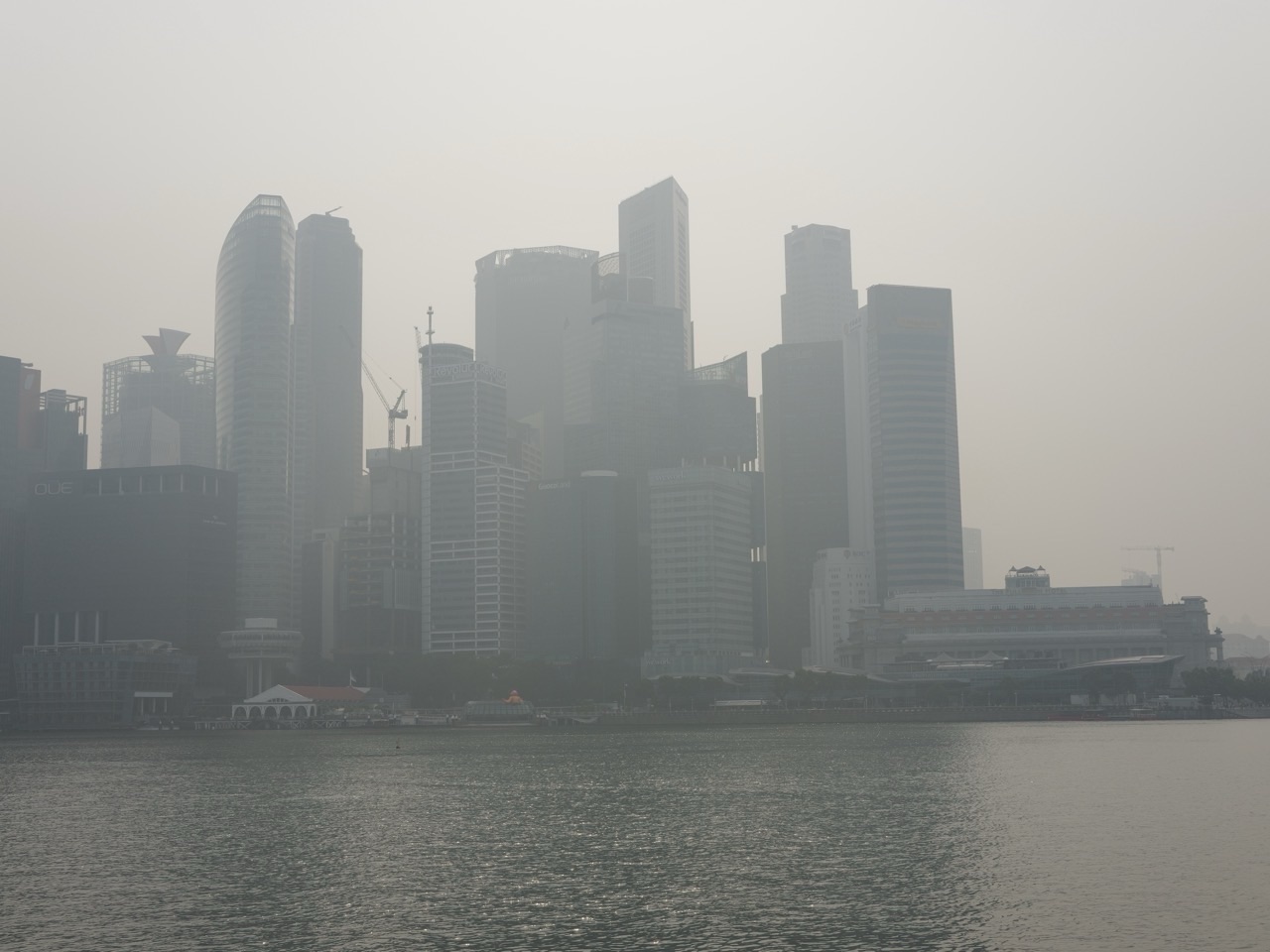
Why is mathematics important when the air itself is invisible? Air-quality work turns tiny particles, gas concentrations, changing weather and thousands of sensor readings into information people can use. The arithmetic is not decoration around the science. Units, averages, index bands, graphs, uncertainty and careful comparisons determine what a measurement actually means. In Singapore, the official public index is the Pollutant Standards Index, or PSI, while many international searches use the phrase Air Quality Index, or AQI. They are related ideas, but they are not interchangeable labels.
This guide explains the mathematics behind air quality, PSI and particulate matter without turning a public-information tool into a medical diagnosis. You will see how concentrations are measured, why an hourly value differs from a 24-hour average, how a pollutant reading can be converted into an index band, why two apparently precise sensors may disagree, and how students can practise the reasoning safely. The goal is a transferable skill: learning to move from a raw number to a justified decision while keeping the limits visible.
The Short Answer: Air Quality Is a Measurement Problem
Air pollution is physical, but the question “How clean is the air?” is mathematical. A monitoring instrument samples air at a place and time. Its signal is calibrated into a concentration. Readings are checked, aggregated over a defined period, compared with breakpoints and reported with units, locations and health guidance. Every arrow in that chain contains assumptions. If the unit, averaging period or pollutant changes, the meaning changes too.
The National Environment Agency’s air-pollution FAQ says Singapore continuously monitors six criteria air pollutants: PM10, PM2.5, sulphur dioxide, nitrogen dioxide, ozone and carbon monoxide. It also distinguishes the 24-hour PSI from the one-hour PM2.5 bands. That distinction is a beautiful example of why numeracy matters: the same atmosphere can be described by several valid numbers because each answers a different question.
- Concentration describes how much pollutant is present in a volume of air.
- Averaging time states the window over which readings are combined.
- An index maps one or more pollutant measurements onto a public reporting scale.
- Exposure also depends on time, location, activity and individual circumstances.
- Uncertainty describes how measurement and modelling limits affect confidence.
Mathematics makes these categories explicit. It prevents a student from comparing a one-hour concentration directly with a 24-hour index, treating one station as the whole island, or assuming that a category boundary is a magical physical cliff.
Start With the Quantity, Not the Colour
Public dashboards often use coloured bands because colours are quick to read. Yet the scientific starting point is a quantity with a unit. Fine particulate matter is commonly reported in micrograms per cubic metre, written µg/m³. “Micro” means one millionth, so one microgram is 0.000001 grams. A cubic metre is a volume: a cube one metre long, one metre wide and one metre high.
Suppose a monitor reports a PM2.5 concentration of 28 µg/m³ over a stated period. The number 28 alone is incomplete. It needs the pollutant, unit, averaging interval, time stamp and location. Compare that with “28 ppm” for a gas or “PSI 28”: those are not alternative spellings of the same quantity. Parts per million is a ratio; µg/m³ is a mass concentration; PSI is an index value. Good mathematical reading begins by naming the object before calculating with it.
What PM2.5 and PM10 mean
The labels refer to particle-size categories used in monitoring, not to a count of exactly identical spheres. PM2.5 concerns fine particles with aerodynamic diameters around 2.5 micrometres and smaller under the relevant measurement convention; PM10 concerns a broader inhalable particle fraction. A micrometre is one millionth of a metre. Size matters because it affects behaviour in air, measurement and potential health relevance, but a public concentration does not tell you the chemical identity of every particle.
Did You Know? The unit µg/m³ combines an extremely small mass with a large volume. That is why apparently modest-looking numbers can represent many microscopic particles. The mathematical habit to learn is scale awareness: write powers of ten, keep units attached and ask whether the magnitude is plausible.
A unit-conversion example
Imagine that a laboratory teaching sample contains 0.036 milligrams of particulate material distributed uniformly through 2 cubic metres of filtered-air chamber volume. Since 1 milligram equals 1,000 micrograms, 0.036 mg equals 36 µg. The concentration is therefore 36 µg ÷ 2 m³ = 18 µg/m³. The calculation is simple, but its logic is powerful: convert compatible units, divide the measured amount by the relevant volume, then state the unit.
If a student mistakenly divides 2 by 36, the result has the reciprocal unit m³/µg and answers a different question. Unit analysis catches the error before any dashboard comparison is attempted.
Concentration, Emission and Exposure Are Different
Three ideas are often blended in everyday conversation. An emission is the amount or rate released by a source. Ambient concentration is the amount measured in the surrounding air. Exposure describes contact over time. A source can emit at a steady rate while local concentration changes because wind speed, wind direction, mixing height, rain and distance change. Likewise, two people in the same city can have different personal exposures because they spend time in different microenvironments.
Consider a purely illustrative source releasing 12 grams of a tracer each minute. That is an emission rate of 12 g/min. It is not an ambient concentration. To estimate a concentration downwind, a model needs air flow, atmospheric mixing, geometry and removal processes. Dividing 12 grams by the volume of Singapore would not produce a useful answer because the atmosphere is neither a closed box nor instantly uniform.
This distinction develops causal reasoning. “Emissions fell” does not automatically mean every monitor must show the same percentage fall at every hour. “A monitor rose” does not identify one source without supporting evidence. Mathematics helps separate a measured pattern from an explanation of the pattern.
| Quantity | Typical form | What it can answer | What it cannot answer alone |
|---|---|---|---|
| Emission rate | g/s or tonnes/year | How much a source releases | The concentration at every location |
| Ambient concentration | µg/m³ or ppm | What a monitor measured in surrounding air | A person’s total dose or the exact source |
| Index value | PSI or AQI number | A communication category under a defined method | The raw concentration without the method |
| Personal exposure | concentration integrated over time | Contact across a person’s activities | A diagnosis or guaranteed health outcome |
Why Averaging Time Changes the Story
Air moves and pollution fluctuates. A one-minute spike, a one-hour average and a 24-hour average compress time differently. The arithmetic mean of equally spaced readings is the sum divided by the count. If hourly concentrations are 12, 18, 30 and 20 µg/m³, their four-hour mean is (12 + 18 + 30 + 20) ÷ 4 = 20 µg/m³. The peak was 30; the mean was 20. Neither number is wrong. They describe different features.
If intervals have unequal duration, an ordinary mean may be misleading. Suppose a monitor recorded 10 µg/m³ for 30 minutes and 40 µg/m³ for 90 minutes. The time-weighted average is [(10 × 30) + (40 × 90)] ÷ 120 = 32.5 µg/m³. Simply averaging 10 and 40 would give 25 µg/m³ and would wrongly give the short and long intervals equal weight.
Rolling averages
A rolling 24-hour average is recalculated as time moves forward. At noon it may cover noon yesterday to noon today; an hour later it covers 1 pm yesterday to 1 pm today. One old value leaves the window and one new value enters. This creates smoother movement than raw hourly readings, but it also means the number contains history. A sudden improvement may take time to pull the rolling average down.
The NEA page on managing haze explains that the PSI indicates the severity of smoke haze and directs the public to official PSI and PM2.5 information and associated advisories. Students should therefore read the averaging label and the current official guidance together, rather than treating one number as timeless.
Median, percentiles and extremes
The mean is not the only summary. A median is the middle ordered value and can be less sensitive to a brief extreme. A percentile states the value below which a chosen proportion of observations falls. Regulators and researchers may use multiple summaries because a system can have a moderate average but occasional high episodes. Choosing a statistic is part of the question, not a neutral afterthought.
Did You Know? Smoothing reduces noise but can hide short-lived structure. Keeping both a raw time series and an appropriate summary allows a reader to see the episode and the broader pattern.
How an Index Translates a Measurement
An air-quality index is a communication function. A defined concentration range is matched to an index range, often by piecewise linear interpolation. “Piecewise” means the rule uses different line segments in different bands. Within a band, the index increases proportionally between its lower and upper breakpoints.
For learning, consider a fictional classroom index—not an official PSI or AQI table. Suppose concentrations from 20 to 40 units map to index values from 50 to 100. A concentration of 32 lies 12 units above 20 within a 20-unit concentration span. Its fraction through the band is 12 ÷ 20 = 0.6. Move the same fraction through the 50-point index span: 50 + 0.6 × 50 = 80. This calculation explains interpolation without pretending to reproduce a current official table.
The general form is: index = lower index + [(concentration − lower concentration) ÷ (upper concentration − lower concentration)] × (upper index − lower index). Rounding and truncation rules matter and are set by the official method. Students should never substitute remembered breakpoints from another country or an old publication.
PSI is not simply another name for every AQI
Countries can use different pollutants, averaging periods, breakpoints and reporting rules. Singapore uses PSI. The United States commonly reports AQI. The labels may share the broad purpose of communicating air quality, but a number from one system should not be converted by renaming it. The defensible comparison is to read each system’s official methodology or compare underlying pollutant concentrations with matched averaging periods.
This is a general lesson in mathematics: two scales can use similar ranges while encoding different rules. Temperature in Celsius and Fahrenheit has a known conversion because both scales are explicitly defined. Two policy indices need not have a universal one-line conversion.
Multiple Pollutants and the Dominant Sub-Index
An overall index may be built from pollutant-specific sub-indices. Conceptually, each pollutant measurement is mapped using the rule for that pollutant and averaging period, then the reporting method combines them. In many systems, the highest sub-index determines the overall category. That approach is designed so a serious value for one pollutant is not diluted by averaging it with low values for others.
Imagine a fictional set of sub-indices: PM2.5 = 84, ozone = 52, nitrogen dioxide = 38, carbon monoxide = 21 and sulphur dioxide = 17. If the rule is “report the maximum”, the overall index is 84 and PM2.5 is the dominant pollutant. The arithmetic mean would be 42.4, but it would answer a different and potentially misleading question.
This example shows why aggregation rules must match purpose. Averaging is useful when contributions are commensurable and compensation is meaningful. A maximum is useful when the system must flag the strongest limiting condition. The rule is a design decision grounded in public-health communication, not merely a mathematical preference.
Sensors: Calibration, Resolution and Uncertainty
A digital display can show several decimal places without guaranteeing equal accuracy. A reference monitor, a research instrument and a low-cost sensor may use different physical principles, calibration procedures and quality controls. Measurements can be affected by humidity, temperature, flow rate, ageing, placement and the composition of the particles being sampled.
Suppose a student compares a low-cost sensor with a reference instrument for six matched periods. If the low-cost readings are consistently 15% higher, that suggests a systematic bias in this dataset. A simple correction might divide by 1.15, but responsible calibration needs more than one percentage: a range of concentrations, an intercept check, residual analysis and validation on data not used to fit the correction.
Accuracy, precision and resolution
- Accuracy concerns closeness to an accepted reference.
- Precision concerns repeatability under similar conditions.
- Resolution is the smallest displayed or detectable change.
- Bias is a systematic tendency away from the reference.
- Random error produces variation that may change direction.
- Uncertainty expresses a justified range or distribution around a result.
A sensor may be precise but biased: it repeats 31, 31 and 31 when the reference is 25. It may be roughly accurate on average but imprecise: 20, 30 and 25 around a reference of 25. These patterns require different responses. Repetition cannot remove a stable calibration bias, while averaging can reduce some random variability.
A residual example
If a fitted model predicts 22 µg/m³ and the reference reports 25 µg/m³, the residual defined as observed minus predicted is 3 µg/m³. Plotting residuals against humidity, temperature and concentration can reveal structure. If residuals rise with humidity, a single constant correction is probably inadequate.
This is where school algebra becomes scientific judgement. The slope and intercept of a line are not just examination objects; they express how one instrument relates to another. Scatter around the line shows what the equation fails to capture.
Spatial Mathematics: One Station Is Not Everywhere
Air-quality monitors sample locations. To draw a map, analysts may interpolate between them, use atmospheric models, combine satellite observations or integrate several data sources. Every map therefore includes spatial assumptions. Nearby places can differ because of roads, buildings, coastal winds, height and local sources. Conversely, a plume can cross large distances.
A simple inverse-distance estimate gives closer stations more weight than distant ones. If station A is 2 km away and station B is 6 km away, weights proportional to 1/d would be 1/2 and 1/6. After normalisation, A receives three quarters of the combined weight and B one quarter. If their readings are 40 and 20, the estimate is 0.75 × 40 + 0.25 × 20 = 35. This is a teaching model, not a replacement for an operational air-quality system.
The weakness is important: distance alone does not know wind direction, terrain or street-canyon effects. A mathematically sophisticated formula can still be scientifically poor if it omits the mechanism that matters. Modelling skill includes knowing when not to trust a convenient equation.
For another look at time-and-space prediction, read Why Mathematics? | Weather Forecasting, Differential Equations and Numerical Models. Weather and air quality are different questions, but both depend on measurements, grids, evolving fields and uncertainty.
Worked Example: Reading a Day Without Overclaiming
Suppose a fictional station records eight three-hour PM2.5 means: 12, 14, 18, 30, 42, 38, 24 and 14 µg/m³. Because the intervals are equal, the daily mean is their sum, 192, divided by 8, giving 24 µg/m³. The maximum interval is 42 µg/m³. The range is 42 − 12 = 30 µg/m³.
Now divide the day into the first four and last four intervals. The first-half mean is (12 + 14 + 18 + 30) ÷ 4 = 18.5. The second-half mean is (42 + 38 + 24 + 14) ÷ 4 = 29.5. The values suggest a rise followed by a fall, but they do not prove the cause. To investigate cause, we would examine wind, rain, nearby activity, regional conditions, instrument checks and other stations.
If a blog headline reported only “pollution hit 42”, it would capture the peak but omit duration. If it reported only “daily average 24”, it would hide the episode. A fair explanation reports the statistic, its window and the pattern. Mathematics supports honesty by showing which claim each calculation can carry.
Add uncertainty
Assume, purely for illustration, that quality checks support an uncertainty of approximately ±3 µg/m³ for the relevant range. The 42 reading might be communicated as about 42 ± 3 under those conditions. That does not mean every value in the interval is equally likely, and it does not erase the reading. It tells the reader not to treat the last digit as absolute.
If a decision boundary lies inside the uncertainty interval, the correct response is not to invent certainty. Analysts may use conservative rules, additional measurements or the official reporting protocol. The policy rule should be stated separately from the measurement result.
Common Misconceptions
“An index of 100 is twice as polluted as 50”
Not necessarily. An index is a mapped communication scale, often piecewise and pollutant-specific. Ratios of index numbers do not automatically equal ratios of concentration, harm or risk.
“The city average is my personal exposure”
No. A regional index describes monitored ambient conditions under its method. Personal exposure varies with time, location, indoor conditions, ventilation, activity and other factors.
“More decimal places mean a better sensor”
No. Display resolution, calibration accuracy and measurement uncertainty are different. A reading of 17.384 can be less trustworthy than a quality-controlled value rounded to 17.
“A correlation identifies the source”
No. Two series can move together because one causes the other, both share a driver, the relationship is indirect or the pattern is coincidental. Source attribution needs physical and contextual evidence.
“A lower average means there were no bad hours”
No. An average compresses variation. Inspect the time series, maximum and duration as well as the mean.
“All air-quality scales are interchangeable”
No. Read the official pollutant definitions, averaging times, breakpoints and aggregation rules for the named jurisdiction.
Which School Mathematics Matters?
Air-quality reasoning draws on more of the curriculum than many students expect. Units and ratio build concentration. Percentages describe change and calibration bias. Algebra expresses interpolation. Graphs show trends. Statistics summarises variation. Coordinates and geometry support mapping. Functions translate a pollutant concentration into an index. Probability and uncertainty help people avoid false precision.
| Mathematics | Air-quality use | Student question |
|---|---|---|
| Ratio and rate | Mass per volume, emissions per time | What is the numerator and denominator? |
| Unit conversion | mg to µg; minutes to hours | Are the units compatible before division? |
| Weighted mean | Unequal observation durations | What should determine the weight? |
| Functions | Concentration-to-index mapping | Which breakpoint interval applies? |
| Statistics | Mean, median, percentile, range | Which feature of the data matters? |
| Graphs | Trends, episodes and cycles | Does the axis begin at zero, and should it? |
| Regression | Calibration and comparison | Are residuals random or structured? |
| Spatial reasoning | Stations and maps | What happens between monitored points? |
This answers a larger question about the benefits of learning mathematics. A formula becomes transferable when a learner can identify its inputs, units, assumptions and limits. The aim is not to memorise every air-quality breakpoint. It is to become the person who asks what the number represents.
A Safe Student Investigation
Students can learn from official public data without exposing themselves to polluted air or making health claims. Choose a short historical period from an authorised dashboard. Record the time, region, 24-hour PSI and one-hour PM2.5 values exactly as labelled. Add weather observations from an official source if available. Do not deliberately seek high-exposure environments, and do not use a phone reading as a medical assessment.
Step 1: Define the question
A useful question is specific: “How did one-hour PM2.5 vary across regions during this selected day?” A poor question is “Was the air dangerous?” because that requires official health guidance, personal circumstances and precise definitions beyond a classroom graph.
Step 2: Preserve metadata
Keep the units, averaging period, region and retrieval time. A spreadsheet column called “air” is not enough. Use names such as “PM2.5, 1-hour, µg/m³, East”.
Step 3: Plot before calculating
Make a time-series graph. Look for gaps, repeated values, abrupt changes and regional differences. Then calculate a mean or range only if it helps answer the question.
Step 4: Write one evidence sentence and one limitation sentence
For example: “In this downloaded set, the East region’s one-hour PM2.5 was highest at the stated time.” Then add: “This observation does not identify the source and does not represent every person’s exposure.” The second sentence is not weakness; it is scientific quality.
Step 5: Check the official advisory
If discussing real conditions, link readers to the current NEA information rather than creating homemade health instructions. The NEA air-quality page provides the authoritative Singapore context.
How Parents Can Build Air-Quality Numeracy
Parents do not need specialist equipment. When an air-quality graphic appears, ask the child five calm questions: What pollutant or index is shown? What is the unit? What is the averaging time? Which location does it represent? What decision is the official source supporting? These questions turn passive reading into disciplined reasoning.
Avoid turning every number into alarm. The educational goal is to recognise scale and context. A child who sees a jump from 12 to 18 should be able to say it is an increase of 6 units and 50% relative to 12, while also stating that the practical meaning depends on the quantity and official interpretation.
Families can also compare headlines with source data. Does the headline refer to a peak, average or forecast? Does it name the region and time? Does it confuse concentration with index? This develops media literacy, percentages and causal caution at once.
How Teachers Can Extend the Topic
At primary level, focus on units, tables and simple averages. At lower secondary level, add rate, percentage change and graph critique. At upper secondary level, use piecewise linear functions, weighted averages, scatterplots and regression. Pre-university students can investigate distributions, confidence intervals, spatial interpolation or simple differential equations for accumulation and removal.
The problem works well across subjects. Science explains particles and instruments. Geography studies transport and place. Computing handles data. English supports precise claim writing. Mathematics supplies the common structure.
For a complementary treatment of samples and uncertainty, read Why Mathematics? | Survey Sampling, Margin of Error and Weighting. A survey respondent and an air monitor are not the same kind of observation, but both topics ask how limited measurements can support careful statements about a larger system.
Careers and Pathways Without Closing Options
Air-quality mathematics appears in environmental engineering, atmospheric science, public health, chemistry, data science, sensor design, urban planning, policy analysis and communications. These careers use different depths of mathematics. An instrument engineer may work heavily with signal processing and calibration; a policy analyst may focus on trends, standards and uncertainty; a communicator must translate technical values without distorting them.
No single school subject guarantees entry or success. Students benefit from mathematics, science, computing, writing and teamwork. They can keep options open by strengthening algebra, units, graphs and statistics, then exploring official datasets or school projects. Career decisions should be based on current programme requirements from institutions, not on a generic online promise.
The broader value is portable. Someone who can audit units, question an average and separate correlation from causation will make better decisions in finance, medicine, engineering and daily life as well.
Frequently Asked Questions
Is PSI the same as PM2.5?
No. PM2.5 is a particulate-matter category, and a PM2.5 concentration is normally reported with a unit such as µg/m³ and an averaging period. PSI is an index that incorporates defined pollutant measurements under Singapore’s method.
Is AQI the correct term in Singapore?
Singapore’s official public index is PSI. “AQI” is a broad phrase and the formal name of indices in some other jurisdictions. When discussing Singapore data, use the label shown by NEA.
Why do one-hour PM2.5 and 24-hour PSI seem to move differently?
They represent different quantities and time windows. A one-hour value responds more quickly to recent change; a 24-hour index contains a longer history and may also reflect the governing pollutant sub-index.
Can I average PSI values?
You can calculate a numerical mean, but it may not have a clear scientific interpretation because PSI is a transformed index, not a raw concentration. For many analyses, averaging matched pollutant concentrations is more meaningful. State the purpose and method.
Why can two nearby sensors disagree?
Real spatial variation, placement, instrument type, humidity, calibration, timing and data-quality procedures can all contribute. Disagreement should trigger investigation, not automatic selection of the preferred number.
Does a higher value prove where pollution came from?
No. Source attribution requires wind information, chemical evidence, source inventories, models and comparisons across time and space. A concentration trend alone is not proof.
What should students use for current health decisions?
Use current official NEA information and advisories. A classroom calculation or consumer sensor is not a substitute for the responsible agency or professional medical advice.
What is the most important mathematical habit here?
Keep the quantity, unit, averaging time and location attached to every value. Most serious interpretation errors begin when one of those labels disappears.
A Practical Learning Ladder
Start by reading units accurately. Next, calculate mass-per-volume concentration and time-weighted averages. Then compare mean, median, maximum and range. After that, study piecewise functions and index mapping. Finally, explore calibration, residuals, spatial models and uncertainty.
- Stage 1: Identify pollutant, unit, place and time.
- Stage 2: Convert units and calculate concentrations.
- Stage 3: Use equal and unequal weighted averages.
- Stage 4: Read time-series and distribution graphs.
- Stage 5: Interpolate within a clearly defined index band.
- Stage 6: Compare sensors with scatterplots and residuals.
- Stage 7: Communicate a conclusion with limits.
Each stage should include estimation. Before using a calculator, predict whether the answer should rise or fall and roughly how large it should be. After calculating, reverse-check the units. These habits protect against a misplaced decimal or incorrect denominator.
Final Perspective: A Number With Its Meaning Intact
A Final Verification Checklist
Before sharing an air-quality conclusion, perform one last audit. Confirm that every column has a unit and averaging period. Check that missing values were not silently replaced with zero. Recalculate one mean by hand. Inspect whether a graph truncates the vertical axis in a way that exaggerates change. Confirm that the text distinguishes measured concentration, reported index and inferred cause. Finally, open the official source and make sure its current terminology still matches your description.
This checklist matters because most public-data mistakes are not advanced mathematical failures. They are lost labels, unmatched periods, inappropriate averages or conclusions that travel farther than the evidence. A careful Secondary student can often prevent them with patience and a pencil. That is a practical benefit of numeracy: quality comes from small checks repeated consistently.
The importance of mathematics in air quality is not that it produces a colourful number. It preserves meaning as evidence moves from an instrument to a public decision. Concentration says how much is in a volume. Averaging says how time is compressed. An index says how a defined method communicates conditions. Uncertainty says how firmly the last digits should be held. Context says what the number does not prove.
That combination is hopeful. Air is complex, yet careful measurement allows communities to observe change, evaluate action and communicate responsibly. Students do not need to become atmospheric scientists before they can participate. They can begin with a unit, a graph and a good question.
Read next: Why Mathematics? | Water Treatment, Chemical Dosing and Flow shows the same disciplined movement from concentration and rate to a real engineered system. The setting changes from air to water, but the mathematical promise remains: make the invisible measurable, and make the measurement honest.