
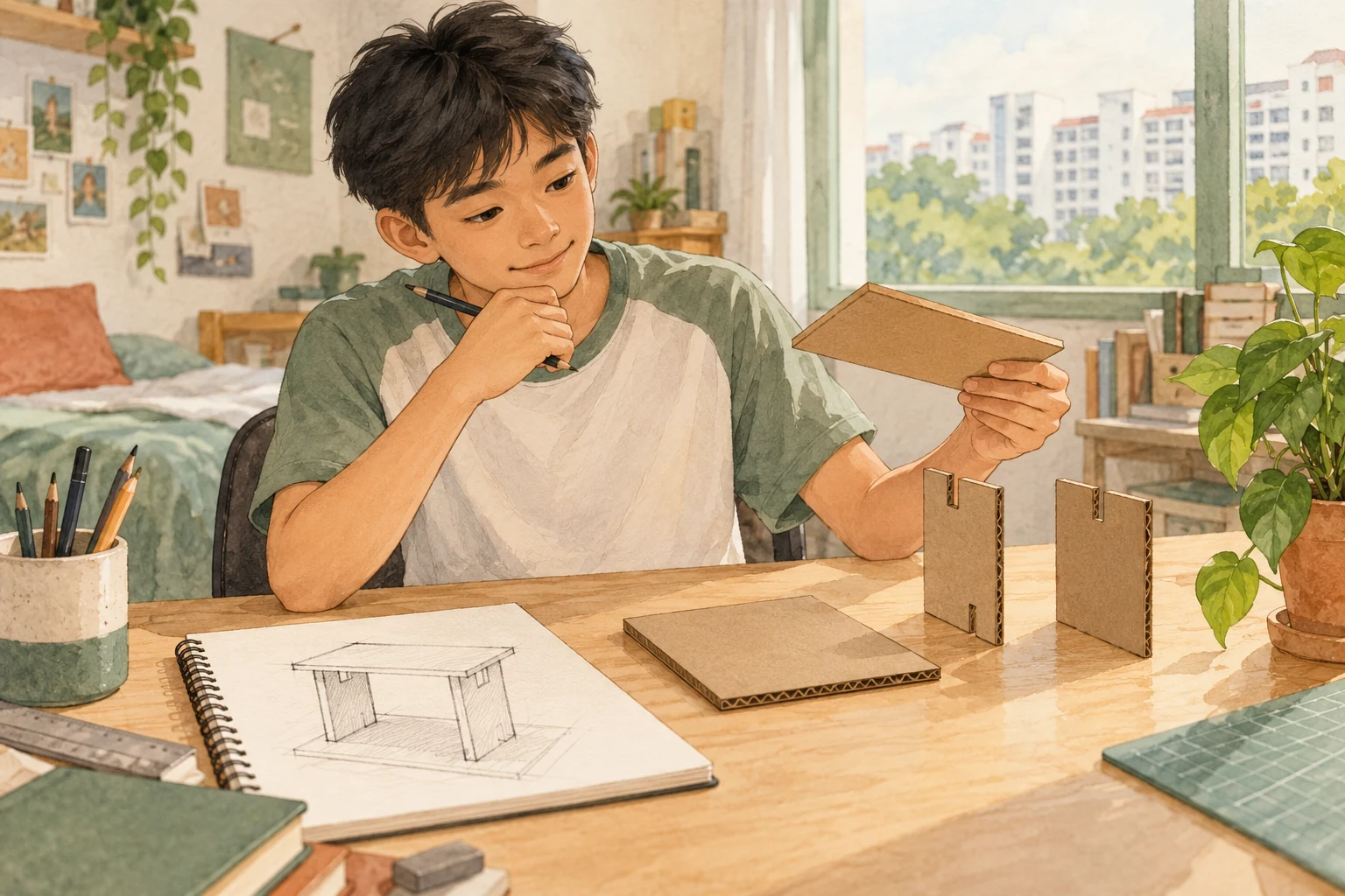
How G1 Art Works | SEC Examination Preparation is a practical guide to understanding what students actually need to see, think, make, explain and submit. G1 Art is not a test of whether someone was “born talented”. It asks the learner to observe visual evidence, understand design and artistic choices, use suitable media, produce a considered response and document authentic learning.
For the 2027 Singapore-Cambridge Secondary Education Certificate (SEC), G1 Art is syllabus K126, formerly referenced as 6128. Paper 1 Art Examination is 40%, with a 90-minute, 40-mark assessment. Paper 2 Portfolio is 60%, completed in 18 hours within eight weeks, and includes 10 screens of visual materials and two artworks in different art forms and media. This distinction is essential: practising only drawing cannot prepare for every question, and building a polished portfolio cannot replace the written-and-practical examination.
This guide explains How G1 Art Works | SEC Examination Preparation for students and parents. It provides a clear paper-by-paper map, original visual-analysis and design-task examples, useful vocabulary, an ethical portfolio workflow, revision routines and realistic expectations. Its first-principles, diagnosis-and-repair organisation draws on eduKateSG’s established Clementi Mathematics tuition reference, but all Art examination requirements are grounded in SEAB’s published 2027 K126 syllabus.
What G1 Art means under Full Subject-Based Banding
Under Full SBB, G1 is the level of an individual subject. It is not identical to a student’s secondary-school Posting Group and is not a permanent description of artistic ability or potential. A student may study subjects at different levels when school policies allow. Parents should check the actual registered subject before purchasing unrelated exam papers.
The SEC is introduced for the 2027 graduating cohort, replacing the separately named N(T), N(A) and O-Level certificates. The change to a common certificate does not combine the art syllabuses into one paper. K126 has its own tasks, duration, submission format and restrictions.
The most useful question is not “Can my child draw like a professional?” It is “Can the learner make a visual decision, show why it serves the idea, and improve it after looking closely?” This is trainable through observation, experimentation, feedback and honest reflection.
The 2027 examination at a glance
Paper 1 — Art Examination (40 marks; 40%; 1 hour 30 minutes). All questions are compulsory. Section A carries 5 marks through formats such as matching, multiple choice or blanks. Section B carries 15 marks through short answers. Section C carries 20 marks for a short art task in which candidates develop a concept sketch and explain the concept.
Paper 2 — Portfolio (60 marks; 60%; 18 hours within eight weeks). Part A Visual Materials is worth 35 marks, presented as 10 screens. These must evidence exploration of two or more art forms and media, with at least one being Design. Part B Art Works is worth 25 marks, consisting of two artworks using different art forms and media; these are not the same artworks selected for Part A.
Assessment arrangements. SEAB states Paper 1 is externally marked, while Paper 2 is assessed by the school and externally moderated. Portfolio work takes place under classroom study conditions; the teacher authenticates the candidate’s work, and the school endorses the submission. Confirm current file naming, format, citation and school submission instructions.
Paper 1 Section A: learn to recognise what you can see
The five-mark opening section is not a reason to skip revision. It can test art terms and the ability to recognise principles in images or designs. Good preparation starts with usable distinctions:
- Line: an edge, mark or path that can direct attention and suggest movement or structure.
- Shape: a two-dimensional bounded area; distinguish it from form, which concerns three-dimensional appearance or structure.
- Colour: choices and relationships that can establish mood, grouping or contrast.
- Value or tone: relative lightness and darkness, supporting depth and emphasis.
- Texture: a surface quality, either physically present or visually suggested.
- Space: the arrangement of areas and depth, including the important role of empty or negative space.
- Contrast: a noticeable difference that can attract attention.
- Balance: how visual weight is distributed in a composition.
- Emphasis: how the artist makes one element the focal point.
- Rhythm and repetition: how repeated elements create order or movement.
These are learning descriptions, not a replacement for the official full syllabus terminology. For each, find an example in a poster, label, drawing or familiar object, then explain its effect.
A student who can recite “contrast” but cannot identify what contrasts in an actual image has not yet secured the skill.
Paper 1 Section B: answer questions about visual evidence
The short-answer section carries 15 marks. Students may need to analyse an image, identify art or design principles, explain the use of materials, or connect artistic choices with the wider world.
A reliable response follows three moves: notice, name, explain.
Notice: What is visibly present? For example, a poster uses one large headline, two small icons and ample white space.
Name: Which relevant principle describes it? The large headline creates hierarchy and emphasis.
Explain: Why does that matter for the intended audience? It makes the main message easier to find quickly.
Do not confuse description with interpretation. “The central area is bright red” is a description. “The red draws attention to an urgent message” is an interpretation. Both can be useful, but a claim about the artist’s personal intention should be presented cautiously unless the question provides that intention.
When the question says “compare”, refer to both examples. Writing a long paragraph about only the first image is not a complete comparison.
Paper 1 Section C: the 20-mark short art task
Section C carries half the raw marks of Paper 1. Candidates interpret a visual stimulus and develop a concept sketch and brief explanation of the proposed idea. A separate reference image may be supplied for consideration.
The syllabus explicitly limits the permissible drawing media. Candidates may use pens, markers, HB or B pencils, colour pencils and colour markers. Charcoal, soft graphite, chalk or soft pastels, oil pastels and all wet media are not permitted for this Paper 1 task. Do not assume that a medium allowed in everyday art class can automatically be brought to this examination.
The task is not an invitation to spend all available time shading a final illustration to perfection. A concept sketch must communicate a response to the stimulus, with visual and design decisions that the explanation can justify.
A student’s practice should therefore include making clear ideas within a time allowance, then writing a few sentences that connect the choices to a purpose.
Original worked example: a school reading campaign poster
This is an original educational exercise, not an official SEC question.
Imagine that the stimulus describes a school initiative encouraging students to exchange books. Design a simple poster concept encouraging participation.
A weak approach begins by drawing many random books and decorating every corner, without deciding whom the message is for or what readers should do.
A stronger approach identifies:
Audience: secondary-school students who might have suitable books.
Purpose: encourage a book exchange rather than an unrelated reading competition.
Message: “Bring a book. Discover another story.” This is an original illustrative line, not official campaign wording.
Visual hierarchy: one strong headline, a central exchange illustration, and a smaller area for the event details that would be supplied by the question.
Visual contrast: distinguish the central exchange action from the background.
Explanation: “I placed the two books at the centre to show the exchange. A limited colour palette keeps the message easy to read, and space below the heading makes the instructions visible.”
What makes the response useful is the relationship between brief, design choices and communication. A technically attractive drawing that never tells viewers what to do could fail the intended job.
Another practice example: packaging that tells the truth
Imagine a fictional brief for a refillable water bottle intended for students. The question asks for a label concept that communicates the product’s refillable nature without misleading environmental claims.
Students could consider recognisable symbols, a simple product illustration, suitable contrast and readable text. They should avoid writing “zero environmental impact” without evidence. That claim could be false.
An honest concept might communicate how the bottle is used and why repeated refilling may reduce the need for certain single-use containers, without pretending the product has no production impacts.
The lesson is that design decisions are not only about aesthetics; they can influence whether an audience understands a message accurately.
How to divide the 90 minutes sensibly
There is no one official time split for every candidate. A reasonable practice plan, to be adjusted after timed work, might reserve an initial period for Sections A and B, protect a substantial block for Section C and leave several minutes for checking both sketch labels and written explanations.
The raw marks are 5, 15 and 20. This suggests that spending most of the examination polishing one five-mark item while leaving the 20-mark sketch incomplete would be poor time management.
Practise a full cycle: read the stimulus, state the problem or intention in one sentence, thumbnail two approaches, choose a clear direction, sketch sufficiently to communicate, add concise explanation, and check whether the answer fulfils the prompt. These are learning steps, not a guaranteed marking formula.
What the G1 Art syllabus teaches beyond the paper
The framework is underpinned by three big ideas:
Art helps us to see in new ways. Students learn to observe rather than accept the first obvious explanation.
Art tells stories about our world. Visual language can express experiences, places, identities and social meanings.
Art influences how we live. Design and images affect how people interact with objects, information and everyday environments.
The syllabus also organises learning around art forms and media, visual qualities and design concepts, contexts, and artistic processes. Its core experiences include portfolio building and design immersion. A good revision plan develops these as connected abilities, not a stack of definitions disconnected from making.
For example, a student designing a school wayfinding sign may draw on visual hierarchy, cultural context, user needs, research, sketching, selection of materials and evaluation of readability. One small task can expose several learning areas.
Paper 2 Part A: ten screens of Visual Materials
The portfolio’s first part requires 10 screens selected from authentic work, including research, drawings, documented experiments, in-progress art and journal spreads. The selection must show exploration of two or more art forms and media, at least one of which is Design.
These ten screens are not the same as “ten final artworks”. They communicate a record of looking, learning, testing and developing a visual approach.
The official syllabus states that the selection need not be in chronological order and that headers or annotations are not required; if used, they should be kept minimal. A useful screen communicates through the selected evidence itself. Dense paragraphs covering the drawings can reduce clarity rather than improve it.
The learner should maintain authentic documentation through the year, then select meaningful evidence for the submission according to the teacher’s instructions.
Paper 2 Part B: two artworks in different media
Part B requires two artworks using different art forms and media. They must be school-supervised works and may not be the same works selected for Part A.
This prevents a common misunderstanding: the candidate cannot simply reuse the same pair of images in two locations and call the portfolio complete. The requirement is for distinct selected works and appropriately differentiated media.
The artworks should demonstrate suitable handling of the chosen material and clear artistic or design intention. One work might communicate a personal observation, while another could explore a design solution. What matters is the actual approved and authentic work and its alignment with the syllabus and submission rules.
Ask the teacher which existing works are eligible for selection and how their documentation should be maintained. Do not invent a new independent home project and assume it can be substituted for an authenticated school artwork.
How the portfolio is assessed
K126 identifies six criteria:
- Interests, Inspirations and Influences: evidence that the candidate investigates ideas and sources.
- Visual Language: experimentation and use of visual qualities and design concepts.
- Art Forms and Media: exploration of different materials and approaches.
- Technical Processes: effective handling of tools, materials and techniques.
- Artistic Expression: clarity and effectiveness of personal expression or design intent.
- Personal Response: engagement, development through difficulties and appropriate acknowledgement of sources.
These six criteria do not imply each is mechanically worth ten separate marks without overlap. The actual assessment model distributes marks across Part A, Part B and holistic personal response. Students should study the official rubric rather than inventing a homemade scoring system.
A strong portfolio records a genuine learning journey. It need not disguise every unsuccessful experiment. A failed colour test, when documented and used to improve a later decision, can demonstrate valuable learning.
Worked portfolio example: turning observation into visual evidence
An original, hypothetical theme is “Quiet corners in a busy city.” A learner notices a shaded bench, a narrow pedestrian passage and reflections on a window.
Possible authentic study materials could include observational sketches, carefully sourced photographs, colour tests and comparisons of visual balance. The student might then explore a poster concept and a separate expressive drawing, using different media as required.
A useful note would be: “The first layout made the shaded bench difficult to see. I increased the tonal separation between the bench and the background and compared the result with the first version.”
This explains what changed and why. It is stronger than adding “Final work improved” without evidence. Any such exercise must be adapted to actual candidate work and school authentication requirements.
Respect for other artists’ work is part of assessment
It is fine to learn from another artist’s method or analyse an image with a properly identified source. It is not fine to present someone else’s original image as your own observational drawing or to silently use downloaded work as assessed personal experimentation.
Record the creator, work and source where known. Explain what feature was studied, such as compositional rhythm or how an object was simplified, and show your own response. SEAB’s portfolio assessment explicitly values respect for secondary sources and acknowledgement.
The same principle applies to AI image generation. A generated image is not proof of a student’s hand drawing, material experiment or authenticated artwork. Follow school academic-integrity guidance for any permitted research or digital assistance.
Visual analysis skill clinic: compare instead of listing
Suppose original practice images show two fictional advertisements:
Poster A uses a large heading and generous empty space.
Poster B uses small lettering, several icons and multiple competing colours.
A direct comparison is: “Poster A establishes a stronger focal point through a single large heading and greater separation from other elements. Poster B provides more information but risks making the main message harder to find at a glance.”
This is a grounded visual observation, not a claim that Poster B is always wrong. If the purpose were detailed reference information rather than fast public communication, a denser layout might be appropriate.
Good visual judgement considers purpose and audience rather than repeating absolute rules such as “more colour is better”.
Drawing concepts: clarity before decoration
A concept sketch should reveal the idea’s important structure. Train in stages:
Stage one — identify the main form. What must the viewer understand first?
Stage two — arrange the layout. Where do the key objects, labels or messages sit?
Stage three — show hierarchy and relationships. Make the important part distinctive.
Stage four — add selective detail. Include enough to communicate how the concept works.
Stage five — explain. Why did you choose these elements for this purpose?
If a student draws detailed shading before establishing the concept, they may run out of time with no clear response to the task. A small thumbnail exercise can help reverse that habit.
Observational drawing: see relationships before naming objects
An inexperienced artist may draw “a cup” from a memorised symbol rather than the cup actually observed. Teaching can begin by looking at proportions, main edges, relative angle, overlap, light and shadows.
Practice with a safe, ordinary object such as a closed pencil case or an empty mug. Look for the largest shapes before tiny details. Compare the drawing with observation, then make one deliberate adjustment.
The learning aim is not photorealistic perfection. It is more attentive perception. That ability transfers to analysing images in Paper 1 and selecting meaningful evidence in the portfolio.
How to build a practical vocabulary bank
Choose a small set of terms and make them usable in sentences:
- Contrast — “Dark lettering contrasts with the pale background.”
- Emphasis — “The central object has the strongest emphasis.”
- Repetition — “Repeated leaf shapes create visual rhythm.”
- Composition — “The composition draws attention from left to right.”
- Texture — “Uneven marks suggest a rough surface.”
- Form — “Shading suggests the volume of the object.”
- Perspective — “Overlapping and relative size help communicate depth.”
- Intent — “The intention is to make the warning clear.”
- Refinement — “The revised version reduces unnecessary detail.”
- Audience — “The bold symbols suit a viewer passing at a distance.”
Ask the student to identify each in a different image. Knowing a definition alone is not proof of visual understanding.
The repeated Art errors that should be repaired
“I don’t know how to draw, so I cannot pass”
Replace this global judgement with a specific skill: proportion, planning, visual vocabulary, concept communication, material control or time. Each can be practised at an appropriate level.
Beautiful artwork that does not answer the stimulus
Repair by writing the brief’s purpose in one sentence before sketching. Check each major design choice against it.
Analysing without referring to visible evidence
Repair with feature → effect → purpose, supported by details from the image.
Relying on one medium for the entire portfolio
Repair by reviewing the official requirement for at least two art forms and media, including Design in Part A, and two different works in Part B.
Overloading portfolio screens with decorative labels
Repair by selecting stronger images and clearer examples of actual experimentation. Use minimal annotations where they genuinely clarify.
Copying reference imagery without acknowledgement
Repair by identifying and attributing sources, explaining influences and preserving authentic candidate work.
Spending all Paper 1 time on the wrong section
Repair using full 90-minute practice, with deliberate protection for Section C.
Assuming all drawing tools are permitted
Repair by following the specific Paper 1 media restrictions; equipment permitted for normal lessons or portfolio work may be prohibited in the examination.
A realistic eight-week preparation route
This is an illustrative study plan, not the official eight-week portfolio schedule or the school’s coursework timetable.
Weeks 1–2: evaluate the baseline
Attempt a few knowledge questions, one visual analysis, one timed concept sketch, and inspect the quality of existing authentic portfolio evidence. Sort problems into terminology, observation, concept, media, explanation or submission readiness.
Weeks 3–4: strengthen design decisions
Practise short responses to familiar briefs. For each, identify audience and intention, produce two small alternatives and explain the selected one. Practise visual elements and design concepts with different images.
Weeks 5–6: work on analysis and communication
Write concise comparisons of images; try unfamiliar stimulus questions and sketch concepts with a limited palette of permitted media. Improve portfolio selection under teacher supervision and check source acknowledgements.
Weeks 7–8: rehearse Paper 1 and final checks
Use representative, timed 90-minute practice. Review which errors persist and practise them through changed tasks. Confirm the official paper’s drawing-media rules and all school-specific submission arrangements.
For Paper 2, the separate 18 hours within eight weeks must follow the official school schedule. Do not treat a generic revision plan as permission to rearrange assessed coursework time.
What parents can do without producing the child’s portfolio
Families can encourage observation: notice why a transport sign is readable, which poster catches attention, how a colour choice changes meaning, or why a package label is confusing. Ask, “What was the artist trying to communicate?” and “What makes you think so?”
Parents should not draw final assessed pieces, produce AI-generated “student work”, fabricate developmental sketches or rewrite a child’s journal to conceal the process. Such assistance damages the authenticity of the assessment.
A useful parent-supported routine might be 15 minutes of observation or visual comparison, 10 minutes of sketch exploration and 5 minutes of explanation, with no claim that this is part of the school’s authenticated coursework.
Exam-day and portfolio checklist
- Confirm registration for 2027 SEC G1 Art K126.
- Paper 1: 90 minutes, 40 marks, 40%.
- Section A 5, Section B 15, Section C 20 raw marks; all compulsory.
- Paper 1 concept sketch: use only the officially permitted drawing media; no wet media or prohibited dry media.
- Paper 2: 60%, 18 hours within eight weeks under required school conditions.
- Part A: 10 screens, evidence of at least two art forms/media including Design.
- Part B: two different-media artworks, different from those selected for the Visual Materials.
- Preserve honest authorship, appropriate secondary-source acknowledgement and teacher authentication.
- Follow official file-format instructions rather than guessing from an older GCE N(T) portfolio.
Frequently asked questions
Is G1 Art assessed entirely by making artworks?
No. Paper 1 is an Art Examination worth 40%, and Paper 2 is a Portfolio worth 60%. Paper 1 includes knowledge, short answers and a concept-sketch task.
Is the Paper 1 sketch worth most of the written marks?
Section C carries 20 out of 40 raw Paper 1 marks. It deserves protected practice time, but Sections A and B also count.
Can a candidate use charcoal or paint in Paper 1?
No. The syllabus restricts Paper 1 concept sketch media and explicitly prohibits charcoal, soft graphite, chalk/soft pastels, oil pastels and wet media.
Are portfolio screens meant to be ten finished paintings?
No. Part A visual materials include research, development, experiments, journal spreads and related authentic evidence. The two artworks are a separate Part B requirement.
Must the portfolio show Design?
Yes. The Part A Visual Materials must explore two or more art forms and media, one of which must be Design.
Does Art depend on natural talent?
The syllabus assesses understanding, application, communication, artistic processes and authentic development. Observation, planning, explanation and media skills can be practised and improved; no guide can guarantee a grade.
Can online tools create the portfolio for my child?
The assessed portfolio must remain the candidate’s authentic work and meet school authentication and academic-integrity rules. Tools may help with permitted research or learning, but fabricated work cannot be presented as personal evidence.
The next useful step
Choose one ordinary poster, one simple object and one student-created sketch. Ask the learner to describe the visible choices, explain their effects and propose one specific improvement. Then give a different example and check whether the learner can do the same thing independently.
That small cycle—observe, understand, make, explain, test—protects what the SEC Art examination actually values.
For related learning see How G1 Design and Technology Works | SEC Examination Preparation and How G1 English Language Works | SEC Examination Preparation. The editorial diagnosis-and-repair structure is adapted from Secondary 1 Mathematics Tutor Clementi | Small Groups Tutorials.
Official sources and limitations
Exam structure checked against published official material on 31 October 2026. Teaching situations, poster ideas and observations here are original illustrations, not official examination tasks or actual coursework submissions. Current school and SEAB instructions determine the permitted materials, file requirements, authenticity and deadlines. No result is guaranteed.