
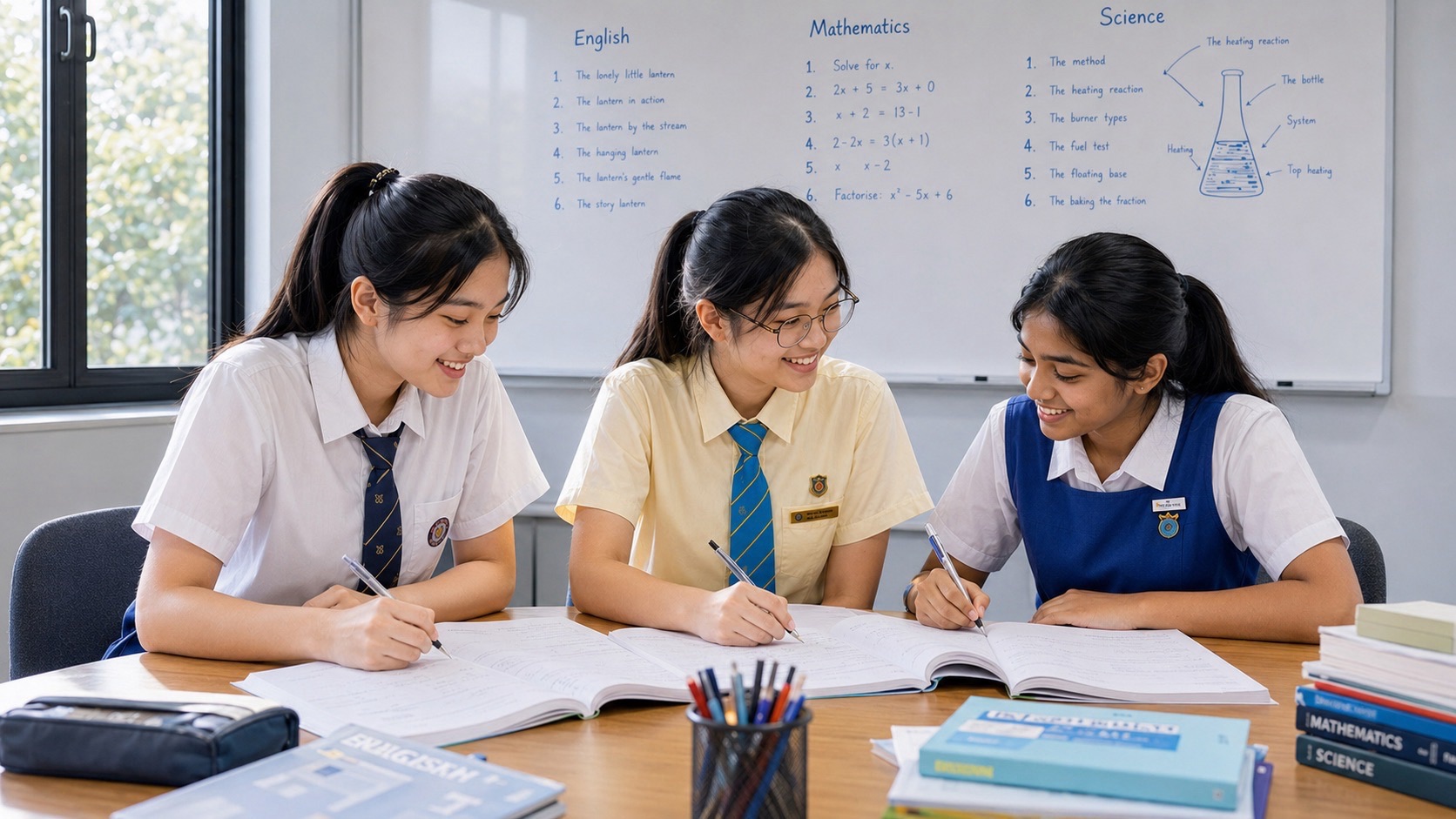
If your child understands the Science lesson but freezes when a graph appears, I would not begin with a harder Chemistry worksheet. I would begin with the first line of the graph: what was measured, in which units, and as what changed? Secondary 1 Chemistry tutor enquiries in Hougang often turn out to be questions about reading information rather than memorising more facts. One carefully explained graph can make a whole chapter easier to use.
In Singapore, Secondary 1 learners ordinarily encounter Chemistry-related ideas within lower-secondary Science, with the depth and sequence determined by their school and G1, G2 or G3 subject level. A table of temperature readings or masses can belong to many topics, not just Chemistry. The reading skills are broadly useful; the scientific explanations must still match the actual course. This guide teaches graphs and tables as a first-year Science skill, not as an imaginary standalone Secondary 1 Pure Chemistry exam.
We are going to build from a tiny table to a reliable interpretation. By the end, your student should be able to find axes, understand a data pair, identify a trend, use numbers as evidence, recognise an unsupported conclusion and design their own clear presentation. The wider curriculum map lives in the Hougang Chemistry library. Here, our job is to make data less frightening.
The moment a graph becomes understandable
Imagine I put a page on the table showing five dots joined by a line. The student says, “I know graphs, but I don’t know this one.” I cover the title and ask them to read the label below the horizontal axis. Then we read the vertical-axis label. At last we look at one dot and describe it in a full sentence. We have not yet discussed the topic. We have decoded the representation.
Science often asks a learner to translate one form of information into another: a paragraph into a table, a table into a graph, a graph into a claim, or a claim back into an investigation. When one translation fails, the student can appear weak in the whole chapter. The practical repair is to isolate the translation. It is not to tell the child to “look harder.”
Your child should not need to be naturally “a graph person.” Reading a graph is a trainable sequence of small decisions. I like it because errors are often visible. We can locate the exact step: swapped axes, wrong scale, forgotten unit, mistaken trend, or a conclusion that goes beyond the plotted evidence.
1. Read the title, axes and units before looking at the shape
A graph is not merely a line that goes up or down. The title and labels tell us what the numbers mean. In a simple cooling graph, the horizontal axis might show time in minutes, and the vertical axis might show temperature in degrees Celsius. Saying “it drops” is a start; saying “the temperature decreases as time passes” is a scientific description.
Ask the learner to point to three things before reading the first data point: the variable on the horizontal axis, the variable on the vertical axis and the units. If a label reads “mass / g,” the numbers represent grams. If it reads “volume / cm³,” the numbers represent cubic centimetres. The abbreviation is part of the data, not small print to ignore.
Be careful with graphs encountered online. They may have broken axes, unusual scales or missing labels. In a school question, students should follow the graph actually provided, not mentally replace it with what they think a standard worksheet ought to show. Real scientific reading begins with the representation in front of us.
2. What the horizontal and vertical axes usually represent
In many controlled school investigations, the variable deliberately changed is plotted on the horizontal axis and the measured responding variable on the vertical axis. Time is often horizontal because observations are made as time passes. These are useful conventions, but the student should still check the actual axis labels instead of assuming every diagram follows the most familiar pattern.
Suppose a practice question gives the mass of a sample at several times while it dries. The horizontal axis may be time in minutes and the vertical axis mass in grams. A point at (3, 18) could mean that after three minutes, the sample has a mass of 18 g, provided those are the indicated units and coordinates. It does not mean 18 minutes and 3 grams.
I sometimes turn the paper sideways and ask the child which number names the input and which names the measurement. The exercise looks silly, but it exposes whether they truly read axes or only follow the shape of a line. We then restore the graph and say each ordered pair aloud as a complete sentence.
3. Use an ordered pair as a complete statement
Think of a point on a graph as a compressed sentence. If the horizontal reading is 2 minutes and the vertical reading is 31 °C, translate it to “At 2 minutes, the temperature was 31 °C.” That is a safer first move than trying immediately to infer the mechanism behind the result.
A student who reverses coordinates can write a fluent but incorrect answer. Another child reads 31 correctly yet omits °C and loses clarity. A third sees a point between two grid lines and reads the wrong interval. These are different errors. We should diagnose them separately because each requires a different kind of practice.
Practice: Draw three points representing time and temperature: 0 min, 25 °C; 2 min, 31 °C; 4 min, 37 °C. Have your child read the second point as a sentence, then identify how temperature changed between the first and third. All data in this example are invented teaching values, not a real experimental result.
4. Reading the scale is more important than counting squares
A vertical axis might have labels 0, 10, 20 and 30 with five small divisions between successive labels. Each division then represents two units, not one. Students who count small squares without checking the labelled interval can be wrong at every point even when their pencil follows the grid carefully.
A useful habit is to calculate the value of one small division once. Take the difference between two labelled numbers and divide it by the number of equal grid intervals separating them. Say the units out loud. Then read one plotted point and check whether the value fits between the neighbouring labels.
Not every graph starts at zero, and not every scale is uniform. A school task might display a shortened axis, or the presentation might be unsuitable for precise reading. Students need to notice that rather than invent certainty. Teach “approximately” when a plotted point genuinely lies between values that cannot be distinguished precisely at the displayed resolution.
5. Tables are already a form of scientific reasoning
Before students make a graph, I ask them to read the table as if it were a story. What was recorded in each column? What is one complete row telling us? Are the units in the headings or repeated in every cell? A table with five neat numbers but no units is incomplete information.
Imagine a teaching table with columns Time (min) and Temperature (°C). Its rows are (0, 25), (1, 28), (2, 31), (3, 34) and (4, 37). The first row says a reading was 25 °C at the starting time. The fourth says 34 °C at three minutes. The repeated increase is visible without calculating anything advanced.
Now ask the child to find the total temperature change and total time interval: 37 − 25 = 12 °C over 4 minutes. If a question asks for the average rate over that interval, the quotient is 3 °C per minute. This particular table happens to increase evenly; a different dataset might not. We need to distinguish that example from a general rule.
6. Plot a point carefully rather than quickly
When plotting, begin on the horizontal axis, locate the x-value, and move vertically to the appropriate y-value. Make a small clear cross or point according to the teacher’s instructions. Large blobs cover the scale and make later reading uncertain. Accuracy here is a presentation skill, not evidence that the child lacks scientific ability.
Before putting pencil to paper, check the range. If the data run from 22 °C to 37 °C, choose a suitable scale that can display the values clearly within the available grid. If the school specifies the scale, use it. If the graph paper begins with an altered starting point, show that alteration clearly rather than silently implying a zero that is not there.
A good check is to take one plotted point and read it back into the original table. Does it return the right two numbers and units? This reverse translation catches mistakes quickly. I prefer students to correct an early wrong point rather than decorate a finished graph whose shape comes from misplaced data.
7. Describe a trend without explaining it too soon
An upward line can mean increasing temperature, increasing mass, increasing volume or increasing concentration, depending on the labels. “The graph increases” is vague. “The measured temperature increases as time passes” is clearer. When the data support it, add the start and end readings.
The word “trend” asks about the pattern. Does the measured quantity generally increase, decrease, remain about constant, fluctuate, or reach a plateau? A graph may contain one unusual point without changing the overall trend. The student should describe both honestly when the task calls for it, rather than pretending every dot sits on a perfectly smooth line.
Causal explanations belong to a different step. If the question only asks what happened, a trend statement is enough. If it asks why the change occurred, the learner must connect the evidence with the science content already taught. That distinction is explored in the companion question-words guide.
8. A plateau is an observation, not an explanation
Suppose a graph shows a temperature that remains constant for several readings while energy continues to be supplied. The flat line is the observation. In an appropriate change-of-state context for a pure substance at the taught level, the explanation may involve energy being used in the change of state rather than increasing the temperature. But the graph alone does not tell us which substance or process is present.
This is where a helpful tutor resists completing the story too early. First ask, “What is constant?” Then, “For how long?” Then, “What does the question say about the material and conditions?” Only after those answers do we discuss the particle model or state change if those ideas are part of the current school topic.
A plateau can also arise in a different kind of investigation for different reasons. Students should not conclude that every flat graph proves melting. Science is not a set of shapes with one memorised label each. The context provides the meaning.
9. Recognise a curve that changes more quickly at first
Suppose a drying mass falls rapidly in the first few minutes, then the decreases become smaller. The graph may be steep initially and flatter later. The student can describe that the mass is still decreasing but at a slower rate over successive intervals. That is more precise than saying “the line is going down” for the entire graph.
To test the idea, compare consecutive differences. If invented readings were 50 g, 43 g, 38 g, 35 g and 33 g at equal time intervals, the successive decreases are 7 g, 5 g, 3 g and 2 g. The total mass is still falling, but the size of each decrease is smaller.
At Secondary 1, a qualitative interpretation may be enough depending on the course. For an extension, calculate the rate over two intervals and discuss what the numbers permit. Avoid assuming a particular cause without information about the investigation. The graph reports what occurred under its conditions; explaining why requires subject knowledge and evidence.
10. Distinguish interpolation from extrapolation
If values at two times are provided, estimating a value between them is interpolation. For example, with an even trend from 25 °C at 0 minutes to 31 °C at 2 minutes, estimating around 28 °C at 1 minute may be reasonable under the assumed straight-line pattern. The estimate relies on the form and quality of the data.
Extrapolation means extending beyond the measured range. Predicting the temperature at ten minutes from a short initial graph can be much less secure because the process may change, slow or reach another regime. A line drawn with a ruler does not guarantee the physical world continues that pattern indefinitely.
I teach students to mark the observed range before making predictions. Inside the range, the estimate may be supported by neighbouring points. Outside, explain any assumption if the question asks. Being scientifically careful sometimes means writing “cannot be determined reliably from these data,” when the task truly lacks a justified model.
11. Understand what “higher” actually refers to
If the graph shows mass against time, “higher” describes a larger measured mass; it does not automatically mean a larger density, temperature or amount of dissolved substance. One of the most common Science mistakes is to borrow a familiar quantity from the chapter rather than read the axis in the current graph.
Give the child three invented graphs with identical rising lines but different vertical labels: mass, temperature and volume. The shape is the same, yet the statements are different. Ask for a sentence about each one, with units if indicated. This helps separate the visual pattern from the scientific meaning.
Next change the horizontal variable. A graph of mass against volume makes a different kind of comparison from mass against time. The words “increases with” require two correctly identified quantities. Students who master that distinction become more confident in unfamiliar chapters because they know what part of the problem to decode first.
12. Compare two lines on the same axes
A school graph may show two substances, two containers or two sets of conditions. Before comparing lines, read the legend or labels. Determine which line belongs to which case; a solid and a dashed line are not inherently “control” and “experiment.” The legend provides that meaning.
I ask students for a comparison on a common basis. At two minutes, which case has the higher temperature? By how much? Over the first four minutes, which changes more? Does one curve level off earlier? These questions make the comparison concrete. “The red line is better” is not a scientific conclusion unless the task defines what better means.
Practice: Imagine line A rises from 20 °C to 32 °C in four minutes while line B rises from 20 °C to 28 °C over the same time. A had the greater temperature increase over that interval: 12 °C compared with 8 °C. That fact alone does not explain the cause. The question must provide enough context to evaluate heating conditions, materials and fair comparisons.
13. Spot a misleading graph without becoming cynical
Graphs are powerful because a pattern can be seen quickly. They can also mislead when axes are truncated, intervals are unequal or a tiny difference fills the entire chart. Your child should learn to check the numbers before accepting a dramatic visual impression.
Suppose two readings are 98 and 100, but the vertical axis starts at 97. Their plotted heights may look dramatically different even though the numerical difference is only two units. That is not automatically an invalid presentation; a narrow axis can help show small changes. It does mean the reader should report the actual scale and size of the difference.
The healthy habit is neither blind trust nor blanket suspicion. Ask, “What do the labels say? How much did the value change? Does the graph support the headline?” This is useful in school Science and later when reading statistics, advertisements and public information as a scientifically literate citizen.
14. Units keep the meaning intact
A number without a unit may fail to tell us what was measured. Five could mean 5 g, 5 cm³, 5 minutes or 5 °C. Each belongs to a different scientific question. Train a simple habit: write the measured quantity and its unit before you calculate, then attach the appropriate unit to the result.
In a mass–volume table, mixing grams with kilograms without conversion creates numerical mistakes. If a sample has a mass of 0.2 kg, that is 200 g. If the volume is 100 cm³, its density expressed in g/cm³ is 200 ÷ 100 = 2 g/cm³. The conversion is part of the reasoning, not merely a formatting rule.
I would not introduce every possible unit conversion to a new Secondary 1 student at once. Start with units appearing in the school’s current chapter. Practise recognising, reading and checking those units in ordinary data questions. When those habits are secure, expand to new quantities.
15. Average rate is not the same as total change
If temperature increases by 12 °C over four minutes, the total change is 12 °C and the average rate is 3 °C per minute. The two numbers answer different questions. A student who writes 12 °C/min has mistaken total change for rate, even though the arithmetic subtraction may have been correct.
At the level where rate calculations are taught, the safe structure is change in measured quantity divided by change in the independent quantity. Choose the two readings appropriate to the requested interval. If the time values are not zero and four, do not simply divide by the larger time label; subtract the earlier time from the later one.
Practice: A fictional table gives 45 g at 2 minutes and 33 g at 6 minutes. The mass change is a decrease of 12 g over an interval of four minutes, giving an average decrease of 3 g per minute. Depending on sign convention, a rate of mass change may be written −3 g/min. State clearly whether you mean the signed change or the magnitude of the decrease.
16. Be alert to anomalies, but do not erase them
A surprising point may be a reading error, a real event or normal variation. Students should not automatically delete it to make the line look smooth. First compare the reading with its neighbours and the experimental notes. If a mistake is found, follow the teacher’s instructions for handling the data transparently.
Consider readings 20, 23, 26, 41 and 32 from otherwise comparable consecutive times. The value 41 may deserve closer examination because it interrupts the nearby pattern, but we cannot identify its cause solely from this sequence. The responsible scientific response is to investigate, not invent a convenient story.
Repeating a measurement under controlled conditions may help check consistency, while inspection of the apparatus and recording method can reveal problems. Never teach a child that an anomalous result is “the wrong one” simply because it disagrees with the answer key. A scientific learner treats surprising evidence as a question.
17. A graph does not establish causation by itself
If two quantities increase together, we can describe an association in the given data. That does not automatically prove that one caused the other. There may be other variables changing, or the observed relationship may depend on the specific circumstances of the investigation.
In a properly controlled school investigation, the question may supply enough design information to support a causal interpretation within that context. Check which variables were held constant and what was deliberately changed. If those details are absent, an explanation that confidently asserts causation may go further than the evidence permits.
I ask students to practise two sentences: “The data show…” and “A possible explanation is…” They can then decide whether the second has adequate support from the investigation and syllabus. This separation encourages accurate thinking without turning every short school answer into a university research report.
18. Choose line, bar or scatter plots for the job
Different graph types emphasise different relationships. A line graph commonly suits measurements over a continuous ordered variable such as time when connecting points is meaningful. A bar chart can be suitable for comparisons among separate categories. A scatter plot helps reveal a relationship between two numerical variables without automatically joining points in sequence.
The graph type is not a decoration chosen at random. If the task gives categories such as three named materials, separate bars may be clearer than a single continuous curve. If it gives temperature at successive times, a line representation may help show change. Follow the teacher’s instruction and conventions, especially when drawing the graph is itself assessed.
A useful learning check is to explain why a chosen graph represents the structure of the data. You do not have to teach sophisticated statistics in Secondary 1. The student only needs to understand that a picture of data should preserve, not distort, what the measurements mean.
19. Distinguish a practical measurement from a calculated result
A table might contain values measured directly with an instrument and a final column calculated from those readings. For density, mass and volume may be measured while density is calculated as mass divided by volume. Label these roles before interpreting the final number.
If a calculated density is unreasonable, go backwards. Was the mass recorded in grams or kilograms? Was the volume read accurately? Was the division reversed? The calculator may have followed the entered numbers perfectly while the scientific setup was wrong. A confident student can audit both the calculation and its meaning.
At an age-appropriate level, students should also understand that all measurements have limits. A reading from a measuring cylinder is not infinitely precise, and a graph drawn by hand cannot yield unlimited decimal places. Accuracy and precision receive a dedicated explanation in the companion measurements and units guide.
20. G1: start with reading and organising observations
For a G1 learner, a short table of clearly labelled observations can be enough to practise scientific communication. Begin with situations that the child can recognise and that match the school’s Science lessons. Ask the learner to say what each row means and find the larger or smaller measured value with the appropriate unit.
You can scaffold with sentence frames initially: “At ___ minutes, the ___ was ___.” Remove the frame as soon as the child can express the information independently. If the learner is not yet studying rates or complex graph interpretation, do not make those the price of understanding a basic table.
MOE’s G1 Lower Secondary Science syllabus and the school’s actual topic outline determine what is expected. The purpose of this guide is to strengthen reading and evidence habits across the Science work the student really does.
21. G2: translate between a table, graph and conclusion
A G2 learner can practise turning a table into a labelled plot, then describing its trend with two supporting readings. The tutor should check whether the child chooses a sensible scale, labels the axes, plots correctly and returns to the original numbers when reviewing the finished graph.
A powerful exercise is to show the learner two plausible written conclusions and ask which is supported. If a graph simply shows increasing temperature, one statement may accurately describe that pattern while another invents an exact cause not described in the task. Explain why the second claim is weaker instead of merely saying it is wrong.
The G2/G3 Lower Secondary Science syllabus offers curriculum context. The actual school assessment still controls the expected detail and type of graph. Strong G2 teaching builds independence through accurate representations and sensible interpretations, not an arbitrary rush into upper-secondary calculations.
22. G3: read relationships carefully and evaluate a claim
At G3, an extension might involve comparing rates over two intervals, inspecting an anomaly, recognising when an extrapolation is risky, and judging whether an explanation goes beyond the experiment. These ideas should be introduced at the level the school is teaching, with the current syllabus in view.
An excellent challenge asks the student to produce two statements from the same dataset: one definitely supported by the readings and one tempting but not proved. Suppose two samples have different masses at equal times. The data show a difference in mass. Without further information, they do not prove which chemical process caused it. This distinction is a foundation of scientific argument.
I like asking a secure learner to correct a misleading graph with missing units or inconsistent intervals. If they can say what must change and why, they have moved beyond recognising a familiar diagram. The skill will matter later in more complex Chemistry, but it belongs to responsible Science from the beginning.
23. A short data-literacy routine before the next test
Set aside ten to fifteen minutes and choose one graph or table from schoolwork already taught. In the first two minutes, name the quantities and units. In the next three, read three points as sentences. In the following three, describe one trend supported by readings. Use the remaining time to answer the actual question and check the response against the data.
One exercise done carefully beats six pages of rushed graph copying. If the learner makes an error, record its type: scale, axes, units, trend, calculation, interpretation or unjustified conclusion. Next time, give a fresh dataset that tests the same skill, not the same picture with new coloured pens.
This is how a tutor can make progress visible. The child who previously reversed the axes now identifies them without prompts. The one who invented causes now separates observation from explanation. Neither improvement necessarily appears immediately as a dramatic grade increase, but both are trustworthy foundations.
24. A longer worked example: cooling water in a classroom task
Consider an invented classroom dataset for water cooling: at 0, 2, 4, 6 and 8 minutes, the temperatures are 60, 52, 46, 42 and 39 °C. The horizontal quantity is time; the vertical quantity is temperature. The temperature decreases through all intervals, but the decreases over successive two-minute intervals are 8, 6, 4 and 3 °C.
A good description says that the temperature falls over the eight minutes, from 60 °C to 39 °C. A stronger description, where requested, notes that the rate of cooling appears to slow over the observed period. The graph does not alone establish the room temperature or what will happen after many hours. We should not demand a numerical final temperature unless the question provides more information or an accepted model.
Now ask the child three separate questions: “Describe the trend,” “Calculate the average decrease per minute over the full eight minutes,” and “Suggest one controlled condition for comparing two cooling containers.” The first needs observation, the second arithmetic, and the third experimental design. One table has become three different kinds of Science reasoning.
25. More mini-exercises with answers and checks
Exercise A: units. A sample has mass 24 g and volume 8 cm³. Density is 24 ÷ 8 = 3 g/cm³. The numbers may be fictional, but the division and unit are meaningful. If the child writes 3 g, ask what was calculated and why the volume unit belongs in the denominator.
Exercise B: reading a line. A plotted value is 15 at time 3 s. Make the learner say both axis labels. “At three seconds, the measured quantity was 15 [units]” is incomplete until the vertical quantity and unit are known. That is precisely the lesson.
Exercise C: fair comparison. Two bars compare the masses of samples of different volumes. Can the taller bar tell us which sample has greater density? Not without the corresponding volumes. The question tests whether the learner confuses a total quantity with a ratio.
Exercise D: anomaly. One reading lies well away from neighbouring points. Should it be removed? Not automatically. Repeat or investigate according to the practical context. The student should explain that an unexpected result is not itself proof of a recording error.
Exercise E: prediction. A line increases over the observed interval. Is the next point guaranteed to be higher? No. Extending a trend is a prediction subject to assumptions. Ask what information would make the forecast more credible.
Exercise F: comparison. Two lines start at 20 °C. After four minutes, A is 36 °C and B is 30 °C. What are their total increases? A rose 16 °C, B rose 10 °C. Then ask what the graph still cannot tell us about cause.
26. What a tutor should do when graph questions keep going wrong
Bring a marked graph question, the student’s working and one plain page of graph paper. Ask the tutor to observe the first attempt rather than demonstrate the correct graph immediately. If the student reads a scale incorrectly, start with scales. If they plot correctly but explain poorly, move the teaching toward interpretation. If they manage both until time pressure arrives, adjust practice conditions without pretending the concept is absent.
In a three-student tutorial, each learner should independently name axes, make a numerical claim and defend it with evidence. Hearing a classmate’s method can be helpful, but copying another learner’s plot does not show mastery. The tutor should vary the values and recheck each student without leading questions.
For Hougang families, confirm the actual teaching venue, the child’s G1/G2/G3 course, school topics, class size and travel arrangement. A page bearing “Hougang” is educational guidance for the area, not proof that every class is physically offered there. Choose teaching that improves the next independent answer, not a promise based on number of worksheets.
27. What parents can ask at home
You do not need a laboratory or expert knowledge to ask, “What does this axis measure?” or “Which two numbers support your claim?” Let the child explain before correcting. If the answer is not clear, ask them to read the labels again. Avoid completing the pattern for them, even when the graph seems obvious to an adult.
A second good question is, “What does this graph not tell us?” That encourages humility and helps children avoid inventing causes. You might hear, “It tells me that the temperature fell but not why it fell.” That is a meaningful scientific distinction for a young learner.
Once the student can read a new graph without prompts, stop and give them room to practise independently. More parental questioning is not always more learning. The best outcome is a child who begins to check labels, units and evidence without needing anyone to remind them.
Questions parents and students ask
Should my child memorise every graph shape?
No. Learn to read the measured quantities, units, conditions and evidence. The same shape can describe completely different phenomena. Recognising a context-specific change-of-state graph can be useful when it is in the syllabus, but the diagram’s meaning comes from more than its silhouette.
Is a missing unit a small problem?
It can be a consequential communication error because a number alone may not identify the measured quantity. Exact mark allocation depends on the assessment. Teach the unit as part of the meaning rather than as a last-second decoration.
Does a G1 student need gradient calculations?
Follow the student’s current school topics and the G1 syllabus, not a generic worksheet labelled Secondary 1. Reading and organising data are valuable regardless of whether the course currently requires formal rate calculations.
Why can my child plot correctly but fail a graph question?
Plotting values and interpreting them are separate skills. Ask for a trend sentence with evidence, then a supported explanation if requested. Inspect the child’s first unprompted attempt so the next lesson repairs the right stage.
How many decimal places should an answer have?
Match the question, the given measurements, the instrument resolution and the school’s stated conventions. Reporting excessive digits from an imprecise graph is not evidence of accuracy. Ask the teacher or tutor when the required rounding rule is uncertain.
What if a graph seems to contradict what the notes say?
Read the axes and experimental conditions carefully first. Then examine whether the data are anomalous, the model has assumptions or the earlier notes described a different situation. Do not silently change the readings to match an expected answer.
Continue to the next useful skill
If graphs are the barrier, practise one unfamiliar data presentation rather than repeating whole chapters. If the student knows the graph but misunderstands “describe” or “explain,” open Science question words and answers. For persistent instrument, reading and unit mistakes, read measurements, accuracy and units. For the weekly learning habit, use the 20-minute Science revision plan.
For curriculum boundaries, use the official MOE G1 Lower Secondary Science syllabus, MOE G2/G3 syllabus and the Hougang Science and Chemistry learning map. They identify the course; the child’s real school materials identify what to practise now.
The sentence I most want your child to be able to say is wonderfully ordinary: “Here is what the data show, and here is the evidence.” That is the beginning of careful scientific thinking.