
Calligraphy is the controlled art of writing. It succeeds when strokes, spacing, language and visual intention work together—not when every letter becomes difficult to read behind elaborate decoration. A short well-made invitation can teach as much about responsible design as a spectacular scroll.
This guide explains calligraphy for beginners, how Latin, Chinese and Arabic traditions differ, why tools affect marks, and how to practise a readable word before designing a complete page. The practical worked example uses ‘hello’ to demonstrate height, spacing and stroke comparison without copying a modern teaching sheet.
Part of The Gold Standard | eduKate Singapore, it complements Drawing, Painting and Journaling. Unlike those articles, this one concentrates on constructed letterforms, writing direction and the relationship between readability and expression.
Quick answer: what makes good calligraphy?
- Choose a language, script and writing purpose deliberately.
- Begin with a recognisable model and an appropriate teacher or reference.
- Match the nib or brush, ink and paper before the final piece.
- Practise a few controlled strokes and consistent letter proportions.
- Treat spacing and readability as parts of the artistic result.
- Respect the meaning, tradition and rights attached to written works.
Calligraphy chapter index
1. Calligraphy communicates before it decorates
Calligraphy is expressive writing in which the shapes and movements of written signs matter. Its purpose may be communication, ceremony, contemplation or visual art. A beautifully ornamented heading can still fail if intended readers cannot identify the words. Conversely, a restrained line of characters can be compelling without elaborate flourishes. The gold standard begins with knowing what a script needs to communicate and to whom.
Imagine a Singapore student making a hand-lettered invitation. The student adds loops to every capital until the event’s date becomes almost unreadable. A better draft puts the essential message—event, date, location—into clear visual order and reserves decorative strokes for the heading. The result may look simpler but works more reliably for the recipient.
Calligraphy is not a contest for the most intricate page. It is a balance among accurate letter structure, controlled marks, cultural understanding and an intended reader or viewer. Those are conditions that can be studied, practised and reviewed.
2. Distinguish handwriting, lettering and calligraphic practice
Everyday handwriting prioritises communicating quickly and legibly. Hand lettering can involve drawing and redrawing each letter as an illustration. Calligraphic practice usually studies a script through the controlled formation of written strokes, although these activities overlap in modern creative work. A beginner who understands the difference can choose a suitable method.
A wedding-card heading may be drawn and refined digitally without following a traditional pen ductus. That can still be excellent lettering. A Chinese brush-written couplet belongs to another lineage whose structure and movement are essential. It would be misleading to call both the same universal technique merely because they contain attractive writing.
The relevant questions are: Are you following a recognisable script? What tool creates the thick and thin marks? How does letter construction work? What is expected to remain readable? Clear definitions prevent a learner from collecting random flourishes without understanding the form.
3. Respect the script’s cultural and historical context
Calligraphic traditions vary across languages and regions. The Metropolitan Museum of Art’s Chinese-calligraphy exhibition describes seal, clerical, running, cursive and standard script types with distinct histories and functions. These are not merely five decorative fonts. They are ways of writing shaped by tools, institutions, aesthetic beliefs and generations of practitioners.
Likewise, the Met’s resource on Islamic calligraphic scripts discusses forms such as kufic and its variations in manuscripts and architecture. Arabic calligraphy cannot responsibly be reduced to disconnected shapes copied by someone who does not understand the language and direction of writing.
A learner should know which tradition is being studied, who created the model and whether the meaning or context restricts its use. Cultural respect is practical accuracy: learn from competent teachers and trustworthy examples instead of treating scripts as interchangeable ornaments.
4. Choose a first script for clarity rather than prestige
A beginner using Latin letters may try a simple broad-edge formal alphabet before elaborate flourished copperplate. Someone learning Chinese brush calligraphy may begin with teacher-selected standard-script characters rather than attempting historical cursive immediately. The route depends on language, prior writing knowledge, tool and teacher expertise.
Do not choose an exemplar only because it looks difficult. The script should offer a manageable number of structural decisions and readable examples. A beginner is better served by practising the relationships among a few letters than attempting a full decorative quotation with unfamiliar proportions.
The first milestone is not ‘I have found my permanent style’. It is ‘I can explain the direction of a stroke, the shape I am making and how another person will read it.’ That foundation leaves room for expressive experimentation later.
5. Understand how the writing tool shapes each mark
A broad-edge pen produces contrast partly through the angle of its flat nib relative to the direction of movement. A flexible pointed nib responds to controlled pressure; a brush has its own relationship among hair, ink, direction and hand movement. These are different mechanisms, and instructional rules should not be borrowed indiscriminately between them.
A beginner can test one tool with a row of short marks: vertical, horizontal and diagonal strokes made at a consistent orientation. Examine which strokes appear thicker and how the tool responds. If every line looks alike despite the intended contrast, check whether the nib angle or technique matches the chosen script.
Good tools should fit the purpose and hand, not confer status. An inexpensive suitable pen and compatible paper may teach more than a beautiful collection of professional nibs used without understanding.
6. Choose paper and ink as a matched system
Paper surface affects how ink spreads, dries and feathers. A very absorbent notebook may create fuzzy strokes with a liquid ink that works perfectly on another sheet. Smooth paper may make one nib glide while another slips. Before making a finished card, use a small test area or spare sheet with the exact pen and ink intended.
Read the product label and match ink to the tool. Some drawing inks are unsuitable for fountain pens and may cause clogging. Others contain ingredients or solvents requiring precautions. The Art & Creative Materials Institute explains the AP and CL safety seals and the importance of intended use. A label is more trustworthy than the claim that anything called ‘natural ink’ must be safe.
In Singapore’s humid conditions, allow enough drying time before stacking sheets and keep ink containers closed. Paper-and-ink compatibility is a practical part of craft, not a detail that can be repaired with flourish afterward.
7. Set up a comfortable, spill-aware workspace
A stable desk, suitable lighting, protected surface and accessible cleaning materials make careful marks easier. Open ink bottles should be placed where a sleeve or moving elbow will not tip them. Keep food and drink away from art materials, and clean hands after using inks according to the actual product’s directions.
Long sessions can also create hand, wrist and shoulder strain. A learner who grips hard to control a nib may benefit from shorter exercises, a more comfortable writing position and appropriate teacher feedback. A student should not endure persistent pain in order to finish an alphabet sheet.
For children, provide age-appropriate water-based products and supervised tools rather than sharp nibs or adult inks without assessment. Safety and accessibility are part of how a workshop earns the right to be called well managed.
Jump to the practical questions
8. Learn the parts of Latin-letter proportions
For a Latin minuscule practice alphabet, it helps to identify the baseline, x-height, ascender line and descender line. These are guides for how short and tall parts of letters relate. The x-height can be described as the height of a typical lowercase x in that script, not a universal fixed millimetre value.
Draw a simple practice grid with baseline at zero, x-height at 5 mm and ascender guide at 8 mm as an illustrative exercise. The numbers are chosen for teaching, not a rule every historical script follows. Write simple letters against the guides and notice when a stem unexpectedly rises or a curved letter crowds the line.
Consistency is useful because it helps readers recognise the alphabet and makes later deviations intentional. Before adding personality, learn what proportion the chosen exemplar is trying to maintain.
9. Practice the stroke instead of only the finished letter
A letter is built from smaller directional actions. A broad-edge n-like form may involve a straight stem followed by an arch. A round o-like form requires controlled curves that meet. Writing whole sentences before these components feel manageable makes it harder to tell whether the main issue is a stroke, a proportion or spacing.
Try groups of five deliberate stems and five rounded shapes, pausing after each group. Look for a repeatable starting position and consistent weight. Instead of writing the same failing stroke fifty times, stop and adjust one variable—angle, motion or paper—then compare the next five marks.
Practise slowly enough to notice the pen’s response. Speed may arrive through familiarity, but uncontrolled haste tends to conceal the exact point where a learner loses the intended shape.
10. Understand rhythm within writing
Calligraphy has visual rhythm: the repeated movement of thick and thin strokes, spaces and ascenders can carry the eye along a line. The rhythm need not be mechanically identical. In some traditions highly personal brush movement is central to the art. But variation is meaningful only when the practitioner has a relationship with the underlying structure.
The Met’s Brush and Ink exhibition describes Chinese calligraphy as a visual art in which gestures are preserved in inked lines. This perspective helps students see that a written mark records movement, not simply a static contour.
Listen to what a repeated line communicates visually. Does it appear hurried, calm, dense or open? The observations are interpretative, but they can be anchored in features such as stroke direction, spacing and line weight rather than empty praise.
11. Space letters and words for the reader
A learner can draw every letter accurately yet produce a sentence that is difficult to decipher because of cramped word spacing or inconsistent gaps. Negative space—the empty area around and inside marks—forms part of the design. In Latin-letter work, the space between two curved letters often looks different from the space between a straight stem and a curve.
Write a short phrase and step back. Do the words separate clearly? Do adjacent letters join accidentally? Is the main title visibly distinct from the supporting detail? These questions are often more important than whether every ornamental line looks elegant.
Spacing is best evaluated from the intended viewing distance. A tiny gift tag and a public event sign have different needs. For a sign, test whether someone unfamiliar with the text can read it quickly without help.
12. A worked five-letter exercise: write ‘hello’
A beginner using an appropriate Latin script can use the word ‘hello’ as a short study. The h offers an ascender and arch, e a compact curve, two l letters repeated vertical structure and o a closed rounded form. The point is not to reproduce a specific copyrighted exemplar; it is to compare visible structural categories in a familiar word.
First write the individual letters slowly on a guide sheet. Then place the letters together, making spacing adjustments without changing their basic proportions. Repeat the word three times, labelling one change between attempts—for example, ‘second version keeps both l ascenders level’.
The final review asks whether the word is readable, whether tall strokes align and whether the e and o are proportionate. If the answer is uncertain, keep the next practice focused on one feature. Five letters can generate a real diagnostic exercise without filling a notebook with unexamined repetition.
13. Use a grid without becoming trapped by it
Guidelines can stabilise height and slant, especially early in learning. But a grid is support, not the finished art. Once the learner can reproduce a few forms consistently, they can explore changes of scale, line spacing or composition that suit a chosen project.
For a card, lay out the key message in pencil before committing ink. Count lines and allow room for margins; the longest line determines whether the word arrangement will fit. Test a draft on plain paper rather than risking the final card as the first rehearsal.
Some scripts are traditionally written vertically or right-to-left. Never impose a left-to-right grid on a tradition whose direction and layout work differently. Respect the actual writing system.
Jump to the practical questions
14. Know when a flourish helps and when it obscures
A flourish can balance an initial capital or complete a decorative border. It can also collide with a neighbouring word, make a letter look like another letter or dominate the text. Add flourishes only after the unornamented phrase is clear.
Try three versions of a name: no flourishes, one controlled flourish and several. Show them to a reader who has not seen the source text. Ask which can be read immediately and which visually feels most suitable. The result is a genuine audience test, not merely the writer’s preference.
A successful decision might be to remove a flourish. Reducing decoration in service of the message demonstrates control over style rather than lack of imagination.
15. Avoid treating cultural scripts as design props
Writing systems carry language, history and, in many contexts, religious or ceremonial meaning. A copied phrase in Arabic or Chinese should not be displayed with a guessed translation. Errors may change a word or produce something offensive or nonsensical. If meaning matters, seek competent language and cultural checking before publishing.
In some traditions there are established conventions for writing names, sacred phrases or formal documents. A beginner may explore shapes as a learner, but representing an exercise as an authentic ceremonial inscription requires more expertise.
A gold-standard teacher can invite artistic curiosity while naming the limits of the class. The learning experience is more respectful when students know which knowledge they have not yet acquired.
16. Use digital lettering without misrepresenting the process
Tablets and design software can support calligraphic lettering, allowing the creator to test spacing or colours without using physical ink. That is valuable, but a pressure-sensitive brush in an app does not have the same behaviour as a nib and liquid ink. Describe the method honestly rather than presenting a digitally corrected image as evidence of a hand-written uninterrupted performance.
Digital tools make revision easy. This can encourage useful experiments in layout while concealing the movement errors a physical teacher might wish to diagnose. Choose whether the lesson is about visual composition or manual stroke control before deciding which tool to use.
Save original and revised versions if they help explain improvement. Do not overcomplicate the archive; keep clear dates and simple labels. A visible development process is more educational than an impressive final export without context.
17. Design one real invitation from the recipient’s needs
Suppose a community arts evening has three essential details: the name of the event, Saturday’s date and the address. The calligrapher drafts the information hierarchy: expressive event name at the top, a short date line and a plainly readable location. The invitation should not require the reader to decode artistic handwriting to discover where to go.
Test a small sheet first, then compose the final piece. If the card uses a photograph or artwork by someone else, obtain the necessary rights for that component. If the event has accessibility information or a registration deadline, ensure those are not lost in decoration.
Give the design to an unfamiliar reader. Can they state the event, day and place? If not, revise the layout rather than blaming the recipient for not appreciating the style. Functional testing is compatible with expressive artistry.
18. Review errors as evidence rather than personal failure
Common practical problems include ink feathering, inconsistent letter height, shaky curves, crowded spacing and blotting from a wet hand crossing fresh marks. Each suggests a different action. Feathering might involve paper-ink compatibility; height problems may need a guide; blotting may demand a revised work order or longer drying time.
Label one visible issue on a practice page and try one relevant change. Avoid changing nib, ink, paper, desk angle and script simultaneously because the next outcome becomes impossible to interpret. Good learning means making a controlled comparison.
Keep the best of the early attempts rather than destroying every imperfect page. Over several weeks a small portfolio of annotated samples can show genuine progress in stroke control and composition.
Jump to the practical questions
19. Respect authorship and exemplar permissions
Historical script conventions may be learned and interpreted, while particular modern teaching diagrams, photographs and letter designs may be protected works. Downloading a beautiful worksheet does not necessarily permit republishing it on a commercial website or selling it as one’s own course material.
Use lawful source links, cite artists and obtain permission where required. The Intellectual Property Office of Singapore provides background on copyright in artistic works. Attribution is not always a substitute for permission, and public-domain status should be verified rather than assumed.
An original teaching exercise can describe common strokes in the author’s own words and photographs without reproducing someone else’s complete illustrated manual. The ethical standard protects both learners and practising artists.
20. The gold standard is a written mark that carries meaning
A beginner may make a compelling piece with one word, while an experienced calligrapher may create a complex scroll or architectural composition. What connects them is thoughtful control of marks and an understanding of the form’s context. Accuracy, readability, artistic expression and historical respect need not be enemies.
A successful practice can be evaluated by the purpose: did a reader understand an invitation, did the learner keep the script’s proportions, was the material handled safely, and were sources and meanings respected? These are concrete questions rather than a vague claim of visual perfection.
The Gold Standard of Calligraphy is not the fanciest alphabet. It is knowing what the written line is for, making each stroke with intention and giving the reader or viewer a work worth engaging with.
A readable word: the ‘hello’ diagnostic
This table uses illustrative Latin-letter measures for a practice grid, not a requirement for other scripts. Try the steps in order and record one change between attempts.
| Part | What to observe | Practical check |
|---|---|---|
| h | Ascender and following arch | Is the tall stem recognisably taller than the short letters? |
| e | Compact curved shape | Is its opening legible rather than filled with ink? |
| ll | Two repeated stems | Are heights and stroke widths consistent? |
| o | Closed rounded form | Is its counterspace still open? |
| Whole word | Rhythm and negative space | Can someone read it immediately at intended size? |
| Revision | One variable, such as nib angle or spacing | Did the next version solve the named issue? |
Frequently asked questions
Is calligraphy just fancy handwriting?
Not exactly. Handwriting, lettering and calligraphy can overlap, but many calligraphic traditions rely on controlled stroke forms, tools and historically developed scripts.
Do beginners need expensive pens?
No. A suitable affordable pen, compatible ink and paper often provide enough feedback to begin learning stroke control and spacing.
What is x-height?
In relevant Latin-letter scripts, x-height describes the height of a typical lowercase x between baseline and x-height guide; proportions depend on the script.
Can I use Arabic or Chinese calligraphy for decoration without understanding it?
For meaningful publication or formal use, have the wording, direction, context and appropriateness checked by someone competent in the language and tradition.
Why does my ink spread into fuzzy edges?
The paper, ink, nib and amount of ink may be incompatible. Test one material change on scrap before redoing the whole project.
May I copy a modern calligraphy worksheet into my blog?
Not automatically. Check the author’s licence and copyright status. Linking, attribution and permission are separate matters.
Museum sources, material safety and related guides
- The Metropolitan Museum of Art: Chinese Calligraphic Traditions
- The Met: Brush and Ink, Chinese Art of Writing
- The Met: Islamic Calligraphic Scripts
- ACMI: Materials Safety for Art and Creative Products
- IPOS: Copyright in Artistic Works
- eduKate: Drawing
- eduKate: Gold Standard master hub
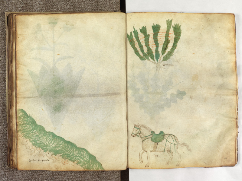
This guide uses original descriptions and exercises; it does not reproduce proprietary alphabets or entire third-party diagrams. The featured media, if shown, depicts a historical illustrated manuscript with handwritten notes rather than a specific exemplar for the scripts taught here.