
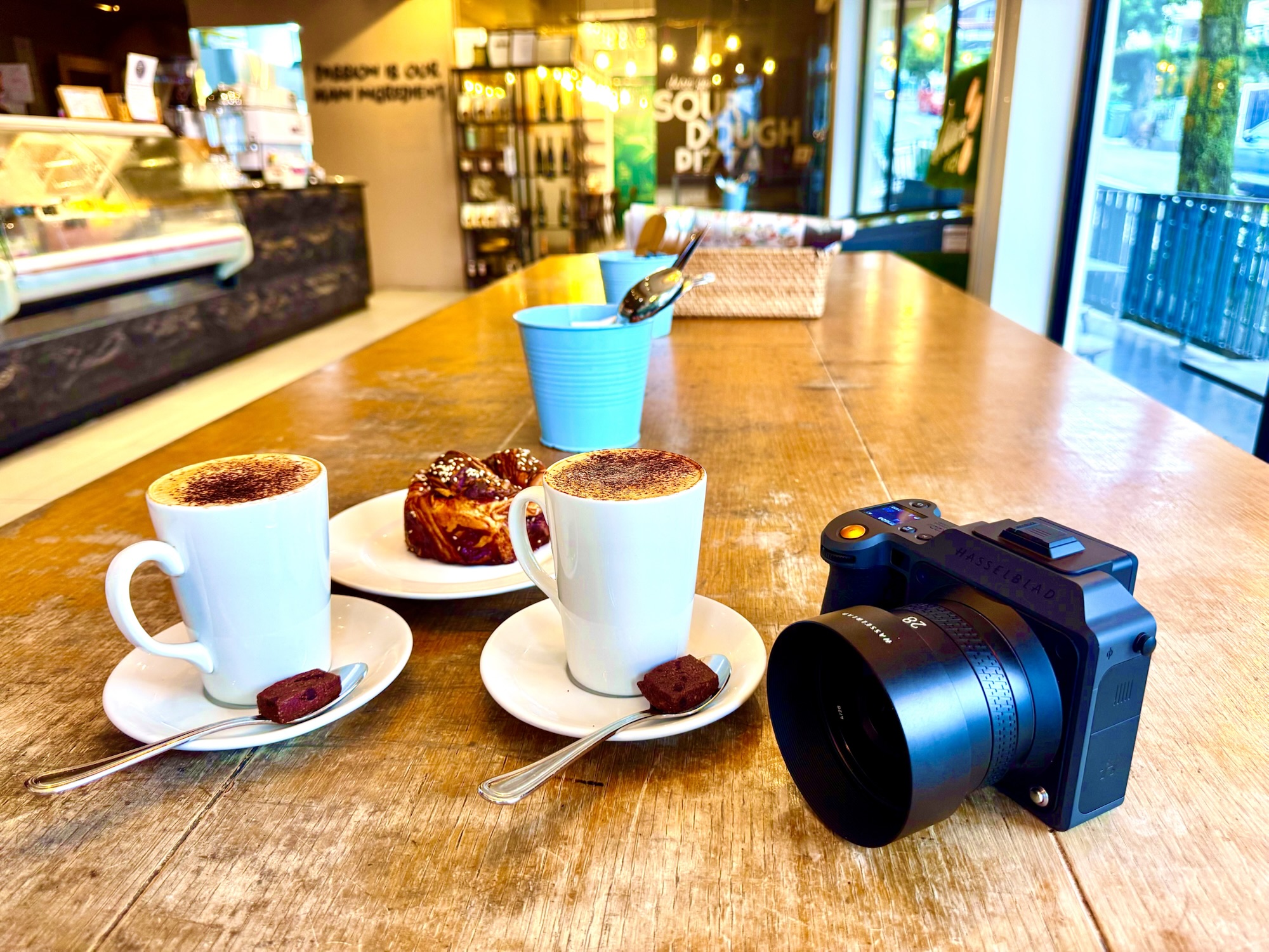
Food photography begins with a delicious problem: the photographer has to make a viewer imagine taste using nothing but light, colour, texture and composition. A beautiful plate can look lifeless in the wrong photograph, while one properly lit spoonful can tell a whole story.
Food photography tips become mastery when light direction, camera angle, styling, texture, focus and timing work together so the dish remains unmistakably the subject. Props, plates and backgrounds should explain the food rather than compete with it.
That is the core aim of food photography mastery: reveal what makes the food appealing, recognisable and worth looking at, without losing the truth of the dish.
The Core Aim: Find the Hero Before Styling the Table
Adobe Lightroom Academy’s food-styling guidance begins with the visual story: decide whether the subject is the ingredient, the cooking process or the finished plate. That decision determines the set.
A fresh loaf may be defined by its crust, a bowl of noodles by the arrangement of ingredients, and a layered cake by the cut section revealing texture. Choose the feature you want a viewer to notice in the first second. Only then add visual support.
A common mistake is assembling attractive ceramics, linen, cutlery and flowers before deciding what they are supposed to say. In that order, the props become the hero and the food becomes an accessory.
Window Light Is the Best Place to Learn
Adobe’s food photography lessons emphasise that window light is abundant and can reveal texture beautifully. Put the dish near a large window and notice how the direction of light changes the apparent shape of ingredients.
Light from behind or slightly to the side can make a glazed pastry gleam and reveal the shape of a soup garnish. Side light can create a useful shadow that makes a plated meal feel dimensional. Flat frontal light is sometimes appropriate for packaging or catalogue work, but it can erase desirable texture.
First move the dish and camera relative to the window. Do not reach for complicated artificial lighting until you understand how one simple source behaves.
Control Light With Reflection and Shadow
A white card opposite the window can return some light into the shadow side of a dish. A dark card can deepen shadow and create greater shape. A sheer diffuser can soften very harsh direct sunlight.
These modest controls are often more useful than a second light source because they teach the relationship between highlight, midtone and shadow.
The goal is not to eliminate all darkness. Shadows provide depth. Control them so the food looks three-dimensional while important ingredients remain visible.
Choose the Camera Angle According to the Food
Overhead photography works well for graphic arrangements: pizza, flatbreads, pastries, salads and several small dishes around a table. The camera can show layout and colour without needing a prominent background.
A three-quarter angle often suits bowls, plated main courses and drinks because it reveals both the top surface and some height. A lower angle can be stronger for tall burgers, stacked pancakes and layered cakes.
Adobe’s presentation guidance explicitly considers the plate and subject together with the intended viewing angle. Decide that angle before fine styling; a beautiful arrangement viewed from the wrong side can hide the feature you meant to showcase.
Pick a Background That Supports the Dish
Background texture, colour and pattern affect the story even when they are out of focus. A simple wooden surface can suggest warmth, a clean pale table can suggest freshness, and dark stone can produce strong contrast around bright ingredients.
Avoid colours or busy patterns that make the subject difficult to read. When a background becomes more memorable than the meal, it is probably asking for too much attention.
Use Props to Establish Context, Not Clutter
A spoon, ingredient, serving cloth or recipe notebook can make the scene feel inhabited. But every prop should answer a question: where is this food being eaten, what was it made with, or what moment is the photograph recording?
Work from background to foreground. Place the table surface and major dishes first, test the light, then bring in garnishes and small details. Adobe recommends preparing the set before the final food arrives so freshness can be preserved.
Freshness Has a Very Short Window
Steam fades, ice melts, sauces spread and delicate herbs wilt. Photographing food is partly a timing problem.
Make a stand-in arrangement with an empty plate or substitute object before the real dish is ready. Check exposure, camera position and composition, then introduce the finished food at the last practical moment.
Use proper food hygiene throughout. Any food used for styling should be treated appropriately, and techniques or products that would make food unsuitable for consumption must never be presented as safe to eat.
Focus on the Texture That Matters
Food photography often benefits from selective depth of field, but very shallow focus can make a plate look like a blurry suggestion rather than a meal.
Choose a focus point that communicates appetite: crisp edges, a glossy sauce, grain on a bread crust or the surface of a berry. If several ingredients matter, stop down enough to keep them readable.
When photographing from above, keep the sensor relatively parallel to the plane of the plate if you want more of the food in focus at once.
Exposure and White Balance Protect Appetite
Underexposure can make bright food look dull; excessive exposure can erase pale sauces and shiny highlights. Check clipping on the brightest ingredients and preserve useful texture.
White balance matters because food colour carries meaning. A neutral cream sauce shifted toward blue may look unappetising; green herbs shifted yellow can appear tired.
Use a consistent lighting source and verify colour with a neutral reference when accuracy matters, especially for menus and commercial food photography.
Composition Needs a Clear Visual Route
Try placing the main dish off-centre when supporting elements create balance. Use cutlery handles, napkin folds or table edges to lead the eye toward the food. Negative space can create calm and leave room for editorial text.
But do not chase composition formulas mechanically. A central overhead bowl can be more effective than a forced rule-of-thirds image. The strongest frame is the one in which the food feels unmistakably important.
Editing Should Refine Rather Than Invent
Adobe Lightroom guidance recommends subtle adjustments to light, colour, crop and effects. Begin with exposure, white balance and tonal contrast, then refine local emphasis.
Avoid replacing the dish’s true colours with a fashionable preset. A commercial food photograph should represent the product fairly. Excessive sharpening can make bread crust or herbs look brittle, while extreme saturation can make ingredients appear artificial.
A Better Food Photography Practice Loop
- Choose one dish and identify its visual hero.
- Select a camera angle that reveals the defining feature.
- Build a simple background and place the main plate.
- Use one window or light source, then adjust with cards or diffusion.
- Set focus, exposure and white balance before the final food arrives.
- Add only the props and garnishes that support the story.
- Take a controlled variation in framing or camera height.
- Edit lightly and compare with the real food.
- Review which image shows texture, freshness and appetite most clearly.
Common Food Photography Mistakes
- Too many props hiding the dish.
- Flat lighting that removes texture.
- A camera angle that hides height or filling.
- Overly shallow focus where only a tiny part of the meal is sharp.
- Waiting until the food has cooled or wilted before deciding the composition.
- Colour grading that no longer reflects the food accurately.
- Using an attractive but inconvenient setup that cannot be repeated for a menu or product range.
How to Know Food Photography Mastery Is Growing
Your setup takes less improvisation. You choose the camera angle with a reason, recognise which direction of light will enhance the dish, and prepare props before the food arrives. Most importantly, the photographs communicate the character of the food consistently rather than only occasionally.
A useful test is to show someone three different frames without explaining them. Can they recognise the dish and describe the texture or ingredient that makes it appealing? If so, your visual decisions are starting to work.
Helpful Reading
Adobe Lightroom Academy: Working With Window Light
Adobe Lightroom Academy: Food Presentation and Styling
Adobe Lightroom: Food Photography With Light and Colour
eduKate: Photography Mastery — Camera Settings
Food photography mastery is the art of making light describe flavour. When the background recedes, the ingredients hold their colour and the texture feels alive, the photograph almost lets the viewer taste what is on the plate.