
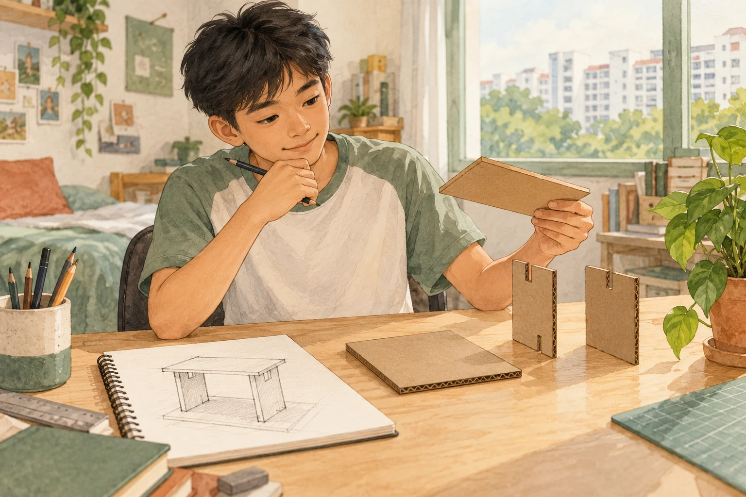
G1 Art in Singapore’s 2027 Secondary Education Certificate (SEC) is syllabus K126. Students need to observe an image carefully, explain how its visual qualities work and connect artistic choices to purpose and context. Visual analysis is not simply calling an artwork beautiful, colourful or creative. It means showing the reader what is visible and why that detail matters.
The 2027 assessment combines a 90-minute Art Examination (40%) and an authenticated Portfolio (60%). In the written Paper 1, Section B provides 15 marks for short answers that may ask about visual qualities, art forms, media and design. Section C provides another 20 marks for a short art task. This guide concentrates on the thinking that makes visual analysis clear rather than pretending every student needs to become an expert painter.
Here is the practical reading route: identify the actual question, observe a relevant feature, explain its effect and keep interpretation proportional to the evidence. The examples below are original exercises, not SEAB examination images or an approved portfolio submission.
Quick answer: the 2027 SEC essentials
In brief: G1 Art K126 visual analysis is a process of observation, description and supported interpretation. Paper 1 Section B tests short answers (15 marks); the entire written paper carries 40% while the supervised portfolio carries 60%.
Official SEAB K126 2027 syllabus PDF · 2027 G1 syllabus directory. This is independent teaching guidance, not an official examination publication.
Contents — jump to the information you need
- Why this skill matters
- Official paper structure
- How the subject works from first principles
- Worked examples
- What mistakes mean
- Four-week plan
- Parents and learning support
- Frequently asked questions
- Official sources and further reading
How Art G1 learning should develop
G1 is a subject level under Full Subject-Based Banding. The Singapore-Cambridge SEC reports the actual level of each examined subject, rather than labelling a child’s total potential. This guide relates to K126 in 2027. Choose learning materials that match the specific syllabus and the student’s current school programme.
The most useful practice is not the greatest amount of work. It is a clear decision loop: understand the task, apply the right concept, observe the outcome, explain the result and repeat with a changed example. That principle is useful across subjects without making their examination formats identical.
2027 K126 official examination format
| Component | Official marks or timing | What candidates must show |
|---|---|---|
| Paper 1 — Section A | 5 raw marks | Fill-in-the-blank, matching and multiple-choice applications of art/design ideas. |
| Paper 1 — Section B | 15 raw marks | Short answers that apply art and design concepts and analyse visual qualities in an image. |
| Paper 1 — Section C | 20 raw marks | Short art task responding to a visual stimulus through design understanding or a concept sketch. |
| Paper 1 total | 40 marks; 40%; 1 hour 30 minutes | All sections compulsory and externally marked. |
| Paper 2 — Part A | 35 marks | Ten screens of visual materials spanning two or more art forms/media, including Design. |
| Paper 2 — Part B | 25 marks | Two artworks in differing media; they are distinct from the visual-material selection. |
| Paper 2 total | 60 marks; 60%; 18 hours within eight weeks | Portfolio internally assessed and externally moderated under school conditions. |
SEAB’s syllabus specifies the national examinations, not the timetable for every school’s internal tests. Where a task is a supervised portfolio or lab examination, candidates must follow the school and examination centre’s current instructions.
How G1 Art works — the underlying skills
Each section below names one learning difficulty and gives an original practice approach. The aim is to connect technique to meaning, so that students can explain their decisions instead of memorising an answer that only fits one familiar task.
Observation is different from preference
A preference says ‘I like the image’. An observation says ‘The largest shape is near the centre while smaller shapes are repeated around it.’ Only the observation gives another reader something verifiable. Preferences can be discussed, but exam analysis requires looking before judging.
Start with a photograph or a teacher-approved artwork and write three statements that anyone can check visually. Then write a separate personal response. Keeping the two columns apart teaches the difference between evidence and reaction.
The command word tells you how deep to answer
A question asking a student to identify a visual element is not the same as asking the student to explain an effect. Long stories can miss a simple identification question, while one-word labels usually cannot satisfy an explanation task.
Underline ‘identify’, ‘describe’, ‘compare’ or ‘explain’. For a description, name what the image contains. For an explanation, link a visible artistic choice to the effect it creates. For a comparison, use the same visual criterion across two images.
Line can guide direction and energy
Lines differ in weight, orientation, rhythm, continuity and sharpness. Repeated diagonal lines may draw the eye towards a point, while a thick boundary can separate regions. Avoid claiming that every straight line has one universal meaning; context changes interpretation.
Place three diagonal marks and one horizontal mark on a blank practice page. Ask which area attracts attention and what changes when the marks become thicker. Describe the result before assigning an emotional label.
Shape and form communicate organisation
Shapes can be geometric or organic and can overlap, repeat or contrast. Form can be suggested through perspective, shading or modelling. A student should distinguish the visible arrangement from a guess about what the artist intended.
Take a fictional poster using circles for different choices. Explain how a repeated shape creates a group. Then ask what happens if one option becomes a large rectangle. The visual change may draw attention to that option.
Colour is relational rather than an isolated label
Naming ‘red’ or ‘blue’ is easy; explaining colour relationships requires more thought. Contrast, saturation, warm/cool relationships and placement all affect how visible information is grouped. Meanings of colours can also vary by culture and context.
Compare two versions of an imagined school event poster. In one, every line uses a bright colour. In another, one accent colour marks the event date. Explain which helps the viewer find the date and why.
Tone, light and shadow affect emphasis
Light and dark values can make an area look more prominent or suggest depth. However, a dark object is not necessarily sad and a bright one is not always cheerful. A strong answer names the tonal relationship and refers to the particular image.
Make a grayscale thumbnail of a simple still life. Identify the lightest and darkest places and ask where the viewer’s eye moves first. Then explain how the pattern supports the drawing’s focus.
Texture can be actual or represented
An actual surface may feel rough, while a painting or digital image can merely depict roughness. Students should not claim they physically touched the surface when the only evidence is a reproduction. The analysis needs to respect what the source shows.
Compare a photographed textile with a digital illustration of the same pattern. Discuss what visual clues suggest weave, grain or smoothness, and separate that observation from information only direct handling could prove.
Scale changes what a viewer notices
An image can feature one large object and many small ones. Size relationships may create emphasis, hierarchy or a sense of depth. Do not confuse ‘larger in the image’ with ‘physically larger in reality’ without contextual evidence.
Create an original flyer in which the date is tiny and the decoration is enormous. Ask what the reader is likely to find first. Revise the scale relationship and explain how the revised design serves its actual purpose.
Space, balance and focal points are linked
Blank space can make a crowded layout easier to read. Visual balance does not require identical left and right halves; asymmetrical arrangements can be stable and effective. Focal points are not necessarily at the geometric centre.
Use two simple compositions of shapes. For each, identify where the viewer looks first and what contributes to balance: size, contrast, repetition or spacing. Avoid answering only that one version looks ‘better’.
Repetition and rhythm work in visual communication
Repeating a motif can establish unity, sequence or movement. A sudden break in repetition often attracts attention because the viewer notices an exception to a pattern. This is useful in artwork and practical graphic design.
Draw a row of equally spaced circles and replace one with a different shape. Explain how the change becomes visible. Then discuss whether the interruption helps communicate the intended message or merely distracts from it.
Composition is how the parts work together
An artwork can contain effective colours and individual shapes yet remain difficult to interpret if these parts have no clear relationship. Composition concerns arrangement, hierarchy, movement and the overall visual experience.
Ask the learner to point to the main area, supporting information and less important details in an image. Explain how the elements help the viewer travel through the work, rather than listing each feature without a connection.
Art and design share visual tools but differ in purpose
A personal artwork may invite reflection or emotional interpretation. A transport sign must help people find a route. Both involve visual decisions, but the evidence of success differs: clarity and accessibility may be critical in the sign.
Compare an imagined expressive drawing of a busy station with an instruction sign for a station exit. Ask what each viewer needs. Do not judge the drawing only by how well it gives directions or the sign only by its emotional richness.
Context helps interpretation without replacing observation
An image may connect to community, history, beliefs or a public event. Context can illuminate why a form or symbol matters, but unsupported guesses about an artist’s intentions are not good evidence.
Discuss an artwork with a verified title, medium and location supplied by a teacher. First describe the composition. Next connect known context to an observed feature. Clearly mark any interpretation as an interpretation, not a private fact about the artist.
A claim needs a visible example
‘The design creates contrast’ is incomplete when the image contains several possible contrasts. A useful explanation identifies which areas differ and how this affects attention or meaning.
Build the sentence in three parts: feature, location and effect. For example, ‘The dark title against the pale background is easy to notice because of its strong tonal contrast.’ Test the same structure on a different image.
Comparisons use one common criterion at a time
Two images can be compared by colour, layout, visual hierarchy or intended audience. A confusing answer describes the colour of Image A but the emotional story of Image B and calls that a comparison.
Set one criterion, such as how each image directs attention. Describe the relevant evidence in A and B, then explain the difference. Only then move to a second criterion if the question requires it.
A short answer should be specific, not ornate
A student may think art writing should sound like a museum catalogue. In G1 visual analysis, clear ordinary words linked to the visible work often communicate more accurately than a paragraph full of abstract adjectives.
Replace ‘The spectacular symphony of infinite colour creates an unforgettable aura’ with ‘The brighter colours near the centre draw attention to the main figure.’ The second statement names what the viewer can actually see.
A concept sketch translates an intention into layout
Paper 1 Section C is a different task from visual analysis but uses the same visual reasoning. A student receives a stimulus and creates a short design response. The sketch should show a legible idea; the explanation should describe its purpose.
Practice with an invented school library poster asking for quiet behaviour. Sketch a layout with a clear symbol and readable instruction, then state why the chosen arrangement helps a busy reader. This is not an authentic SEC stimulus.
The portfolio must remain the student’s own work
The 60% Portfolio includes visual research, process and two artworks under school conditions. Visual analysis can support portfolio reflection, but a parent or tutor must not generate or alter authenticated submissions for the candidate.
Practise describing unrelated artworks at home and seek the subject teacher’s instructions for the actual portfolio. Respect citation and image-use rules when drawing on other artists’ work.
Original worked examples
The scenarios below are independent educational exercises. They are not past SEAB questions or guaranteed future examination content.
Example 1 — a poster nobody can read
An imaginary charity-event poster has a large decorative background, tiny white lettering and four equally prominent slogans. A student claims that the image is effective because it has ‘many colours’.
The stronger analysis notes that the small low-contrast information may be hard to read and that too many equally large elements compete. A revised version could increase text contrast and create a clear hierarchy for the date and venue.
Example 2 — one changed element
An original composition uses six identical blue circles arranged along a horizontal line. The final circle becomes larger and orange. The learner is asked where attention goes and what makes the change noticeable.
The last circle is a likely focal point because it differs in colour and size from the repeated group. The answer should name both visible contrasts rather than invent the maker’s personal feelings.
Example 3 — context and evidence
A fictional artwork depicts a familiar housing block with a small playground beneath it. The student says the artist ‘definitely hates city living’ because the buildings are grey.
Grey buildings alone do not establish hatred of city life. A careful response describes the tones, spatial arrangement and activity shown; any claim about intention needs additional evidence such as a verified statement or title.
Mistake diagnosis: find the actual point of confusion
| What happens | What it may mean | A targeted next step |
|---|---|---|
| Writes ‘beautiful’ and stops | Preference replaces visual evidence | Identify a visible element and explain its effect. |
| Names colour without location | Evidence is too vague | Specify which area uses the colour and what it draws attention to. |
| Claims every diagonal line expresses danger | Interpretation presented as universal law | Use the actual composition and context to support meaning. |
| Makes an artist-intention claim without evidence | Context and inference are mixed | Label observation separately from interpretation. |
| Compares different features across two images | No shared criterion | Compare the same element or purpose in both images. |
| Writes a long essay for a one-mark identification | Command word ignored | Match answer length to the task and evidence required. |
| Creates an illegible concept sketch | Function and audience not considered | Define the intended reader and focal information first. |
When an answer is wrong, ask what process produced it. A missing observation, formula reference, data range or interpretation needs its own repair. Repeating the same corrected question is not enough; use a different example several days later to test whether the idea transfers.
A practical four-week learning plan
This plan offers a manageable diagnostic cycle, not a guaranteed grade improvement or a substitute for the authorised examination programme.
Week 1 — Observe before judging
Describe three different images using only verifiable features. Label line, shape, colour, size and placement without saying whether you like them.
Week 2 — Explain visual effects
Select two features per image and explain how each contributes to emphasis, hierarchy, mood or meaning. Test whether a reader can locate the same feature.
Week 3 — Compare and apply
Compare two posters with the same purpose. Then make an original concept sketch to communicate an instruction and explain the design decisions.
Week 4 — Practise the actual question types
Mix short identification, analysis and concept-sketch tasks within sensible timing. Use a fresh image, school feedback and a short error log to assess independent progress.
A short weekly routine
- Recall one old concept without looking at the model answer.
- Apply it to one unfamiliar example.
- Explain the decision and point to the evidence or calculation.
- Repair the biggest error in a short log.
- Check that the learner can do the same thing independently next week.
How parents and tutors can help
One student may need foundation repair; another understands the idea but works inconsistently; a third needs extension. These cases should not receive the same generic worksheet pile. Ask the student to locate the first uncertain step, then decide what to teach next.
The immutable Clementi Secondary 1 Mathematics tutorial reference provides the communication structure for this series: immediate information, meaningful first principles, observable misconceptions and practical next steps. This article uses the structure with independently verified K126 subject requirements; a successful Google search position cannot be guaranteed through layout alone.
eduKateSG’s three-student small-group tutorials are an option for targeted explanation and feedback, not a requirement for every learner. Where official coursework or lab work is involved, school rules and candidate authenticity take priority over outside instruction. No responsible educator can guarantee a specific SEC grade.
Frequently asked questions
What is the G1 Art SEC code for 2027?
K126, according to the SEAB G1 syllabus.
How many marks is visual analysis worth?
Paper 1 Section B is 15 raw marks. The syllabus states short-answer questions may require visual-quality analysis, but not every mark is assigned to one fixed topic.
Is all of Paper 1 writing?
No. Section A has selection or short formats, Section B short answers, and Section C a short art task.
How much is the portfolio?
Paper 2 carries 60% of the subject: 35 marks for ten screens of visual materials and 25 for two separate artworks in differing media.
Does every colour have one emotional meaning?
No. Interpretation depends on its relationship with other features and the particular cultural or visual context.
Can a student disagree about what an image means?
Interpretation may differ, but a useful answer still needs specific visible evidence and relevance to the question.
Can a private tutor create the portfolio?
No. Authenticated assessed work must remain the candidate’s own under school supervision.
How can parents help without knowing Art terminology?
Ask what the child notices, where it appears and why it matters. The simple observation–effect habit is a useful foundation.
How do we know whether progress is real?
Use an unfamiliar but related task after several days. The learner should recognise what is required, explain why one method fits and identify a previous mistake without being shown the corrected model. That is stronger evidence than finishing an identical worksheet more quickly.
Official references and continuing reading
- SEAB official K126 syllabus PDF for SEC 2027
- SEAB 2027 G1 school-candidate syllabus index
- eduKateSG G1/G2/G3 all-subject syllabus finder
- Main G1 Art SEC Guide
- Focused eduKateSG companion
- Immutable Clementi first-principles tutoring reference
Beyond the exam: Visual literacy helps students interpret posters, public information, interfaces and cultural images. It teaches people to notice before assuming.
Arrange an eduKate Singapore parent–student consultation · Contact eduKateSG
Editorial verification: 5 November 2026, based on the published SEAB 2027 G1 syllabus. Current examination instructions and school requirements take precedence. All worked examples are independently created.