
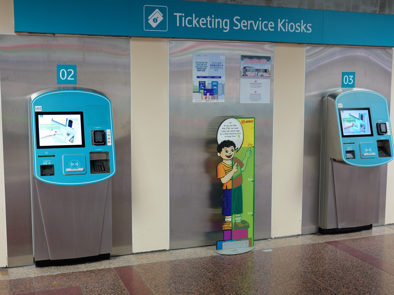
A good interface helps people understand a choice, take an appropriate action and know what happened. Its success lies in clear information, reliable controls, accessibility, helpful recovery and verifiable outcomes—not in decorative complexity.
This guide presents ten connected chapters, WCAG 2.2 context, two worked user-completion comparisons, official references and links into the eduKate knowledge network.
THE GOLD STANDARD · INTERFACE DESIGN
Help people finish real tasks with clarity and dignity
Chapter index
- Start with the user’s real task
- Separate navigation, information and interaction
- Create meaningful visual and semantic hierarchy
- Explain every control and every interface state
- Support keyboards, touch and cognitive accessibility
- Worked example: count real completion correctly
- Make validation and recovery understandable
- Evaluate with real tasks and representative users
- Practise measuring unequal outcomes honestly
- Continue through the connected eduKate network
1. Start with the user’s real task
Back to contentsAn interface succeeds when people can complete a legitimate task and understand what happened. A ticketing kiosk, school portal or registration form must explain available choices, relevant requirements and next steps. An attractive screen is insufficient if a person cannot determine eligibility or whether a transaction succeeded. Begin with the result and work backwards to the information and controls needed.
Observe people in contexts resembling real use. Some encounter the service directly from search, while others work on small screens or with assistive technologies. Users may have unfamiliar terminology, interrupted connections or limited time. ISO 9241-210:2019 describes human-centred design activities throughout the interactive system lifecycle, including understanding use and evaluating designs against real needs.
A task definition should state the user’s goal, required information, major obstacles and observable completion. Do not assume the intended journey begins at the homepage. Research should identify why a step fails, not merely whether participants say the interface looks modern.
2. Separate navigation, information and interaction
Back to contentsNavigation helps users reach a page; information architecture helps them understand its contents; interaction design enables them to act. These functions overlap but can fail independently. A service may have excellent menus and poor field labels, or clear instructions but an inaccessible submission control. Test each aspect rather than calling every problem a navigation issue.
Design for people who enter halfway through a site through a shared link or search result. Give each page a descriptive heading, useful context and an understandable route to related material. Place eligibility, price, evidence requirements and consequences near the decisions they affect. Users should not have to decipher organisational jargon to understand what they are being asked.
Differentiate saved drafts, submitted requests, accepted applications and completed outcomes. These states matter whenever money, identity or rights are involved. A vague success animation should never imply that downstream processing has finished when the service knows only that a message was received.
3. Create meaningful visual and semantic hierarchy
Back to contentsHeadings, spacing, readable type and grouping should communicate relationships before the user reads every sentence. A prominent action should match the user’s next sensible step, not simply the organisation’s marketing priority. Good hierarchy remains intelligible in a narrow layout, when text is enlarged and when translated labels become longer.
Semantics matter as well as appearance. Proper headings, associated labels and structural lists help browsers and assistive technologies communicate the same information presented visually. The Web Content Accessibility Guidelines 2.2 address perceivability, operability, understandability and robustness. Passing one contrast check does not demonstrate conformance with every applicable criterion.
Avoid communicating instructions solely through decorative icons or changes in colour. Explain why a field is required and what information it accepts. A correct interface should remain usable when users magnify text or navigate sequentially rather than scanning a wide desktop screen.
4. Explain every control and every interface state
Back to contentsA form field needs a persistent label and relevant guidance, including expected dates, units, permitted formats or optionality. Placeholder text disappears when entry starts and is not a dependable substitute for a label. W3C’s WAI Forms Tutorial explains accessible instructions, grouping and validation. Clear control wording prevents errors and gives users greater confidence.
Design the states that people encounter: default, focused, selected, busy, rejected, saved, completed and unavailable. A disabled button without an explanation leaves people guessing. A spinner without an eventual result encourages retries. Error text should tell a user what can be corrected, while final confirmation should describe the actual state of the underlying transaction.
If someone completes several valid fields but makes one mistake, preserve appropriate earlier answers. This reduces effort and supports accessibility. For a consequential transaction, identify the next step and the reference by which someone can check status, where the service can provide one legitimately.
5. Support keyboards, touch and cognitive accessibility
Back to contentsPeople may navigate with keyboards, touch, screen readers, switch devices, voice commands or mixed input methods. A task that requires dragging without an alternative can exclude users. WCAG 2.2 added criteria concerning dragging movements, focus, target size and accessible authentication. The target-size minimum includes specific exceptions; it is not an unconditional one-size-fits-all pixel rule.
Test focus order and focus visibility rather than relying only on automated reports. Sticky headers and overlays can hide focused controls. Under the WCAG 2.2 AA focus-not-obscured criterion, the focused component may not be entirely hidden by author-created content; the enhanced AAA criterion is more demanding. Observing actual keyboard use reveals many problems that screenshots cannot show.
Cognitive accessibility includes clear language, predictable steps, helpful recognition cues and less unnecessary memory effort. Support suitable authentication approaches, password managers and permitted copy-and-paste rather than needless transcription. Accessible design is not a decorative addition; it changes whether legitimate users can complete the service.
6. Worked example: count real completion correctly
Back to contentsIn a fictional public-service application funnel, 240 people start a form, 180 submit it successfully, 162 of those submitted forms pass initial checks without correction, and 150 eventually receive confirmed completion. The stages are nested within the same starting group. The numbers illustrate measurement, not a real organisation or a live website.
Submission among starters is 180 ÷ 240 = 75%. First-pass validity among submissions is 162 ÷ 180 = 90%. Confirmed completion among everyone who began is 150 ÷ 240 = 62.5%. Reporting a general 90% success rate would conflate initial validity with the intended end-to-end outcome. Each percentage is correct only with its corresponding denominator.
The missing completions are not necessarily caused by interface design. Some people decide not to proceed, while others face eligibility problems, validation failures, accessibility barriers or downstream processing. Compare error logs, appropriate interviews and task observation before recommending a particular redesign.
| Fictional form stage | Count | Denominator |
|---|---|---|
| Started | 240 | Starting cohort |
| Submitted | 180 | 75% of starters |
| Initially valid | 162 | 90% of submissions |
| Confirmed | 150 | 62.5% of starters |
7. Make validation and recovery understandable
Back to contentsHelpful validation identifies the issue and proposes a correction. ‘Enter a date in the past’ is better than ‘invalid value’ when a date must precede today. Place clear text beside the relevant field and provide an accessible summary for longer forms. The GOV.UK Design System’s error-summary component documents a practical approach with links back to erroneous answers.
Client-side checks can improve the experience but must never be treated as a security boundary. Server-side checks remain necessary. Preserve entered data when reasonable, explain which information is saved and make help available. When a service uses more than one backend system, an accepted request may not be a completed transaction.
Network interruptions need explicit handling. The user must be able to determine whether a request succeeded before resubmitting. Technical methods such as idempotency help prevent duplicates, but the interface also needs truthful status text. Error recovery should protect the user’s work instead of punishing an ordinary connection failure.
8. Evaluate with real tasks and representative users
Back to contentsUsability studies should test defined outcomes, not merely how fast people click. Record actual completion, errors, assistance, confidence and accessible operation. Include participants using relevant devices and assistive technologies, and avoid treating employees familiar with a system as representative of every prospective user.
Specify success before testing. Reaching a confirmation-looking screen is not a complete application if the information has not been accepted. Research should not lead participants to the designer’s favourite answer. A small study may identify important usability problems but cannot automatically estimate a population-wide failure rate with high precision.
After revising a design, test again. A quicker average response may hide poor performance among users with unfamiliar language, accessibility needs or complicated cases. Combine technical accessibility assessments with task-based findings. These complementary forms of evidence help determine what should change next.
9. Practise measuring unequal outcomes honestly
Back to contentsIn a fictional test, 80 users take an assisted route and 120 take an unassisted route. Sixty assisted users and 108 unassisted users finish. The two observed completion shares are 60 ÷ 80 = 75% and 108 ÷ 120 = 90%. The overall sample fraction is 168 ÷ 200 = 84%.
The 84% aggregate conceals a fifteen-percentage-point difference. Yet the difference does not prove the assisted route caused difficulty. Participants may select assistance precisely because of disability, language needs or case complexity. A fair analysis describes recruitment, definitions and specific obstacles before drawing causal conclusions.
The next useful step is targeted research. Check whether calendar controls, terminology, staff instructions or identification requirements create uneven barriers. A subsequent comparable test can show whether a focused improvement helps, without stigmatizing people who need support.
Practice answer: Assisted 75%, unassisted 90%, combined 84%. A 15-percentage-point gap is visible only when the groups are reported separately.
10. Continue through the connected eduKate network
Back to contentsThe related Interaction Design subject examines how people act and receive feedback; Information Systems explains organisational context and data workflows. Interoperability and Systems Integration clarify why a usable screen still depends on correctly functioning downstream services.
Accountability connects to Information Governance, while Statistics supports accurate funnel and subgroup measurement. Ethics provides tools for addressing consent, fairness and exclusion; Technology offers a broader systems perspective. Education connects clearer explanations with understanding and meaningful learning.
The transferable standard is to state the user’s real goal, design a safe and understandable route, observe how varied people use it, verify the outcome and correct problems honestly. A screen is valuable when legitimate users can complete tasks—not because it earns admiration in a design presentation.
Frequently asked questions
Is interface design just visual style? No. It includes content, tasks, controls, feedback, accessibility and errors.
Does WCAG conformance guarantee good usability? Not by itself; testing with relevant users remains important.
Is 90% initial validity the same as final completion? No. The groups and stages differ.
Can a mouse-only interface be accessible? Keyboard support and other applicable accessibility criteria must be considered.
Authoritative sources
ISO 9241-210:2019 describes human-centred design. WCAG 2.2 and Understanding WCAG 2.2 explain web-accessibility requirements. The WAI Forms Tutorial, form validation guidance and GOV.UK error-summary component provide concrete implementation examples.
All form and subgroup data are fictional teaching examples. Technical conformance and observed usability require a defined evaluation scope; numerical comparisons alone do not prove a particular design caused an outcome.